
My camera and I are still getting to know each other, and our initial conversations were ad hoc, leading to arbitrary and poorly documented results in the previous posts. Finally, the scientist in me couldn’t help but come out, and I’ve completed a parametric study on shutter time and Picture Control, with some initial analysis on post processing either the RAW or JPEG files. Documented here are my preliminary results, where I am basically using this post as my lab notebook.
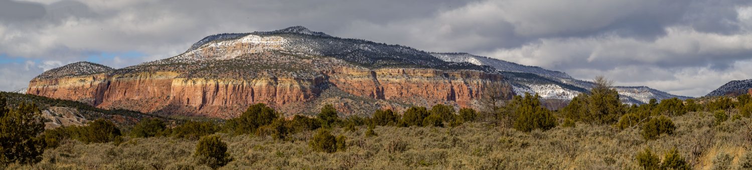
First, using an archetype landscape of the Sandias (not shown here), I swept through all 28 Picture Control options, which set clarity, sharpening, contrast, brightness, saturation, hue (coloration), filter effects and toning in the JPEG images processed by the camera. Based on these results, I eliminated several that I didn’t like, and kept 14 for further research. Next, I completed a test matrix of the remaining 14 picture controls and a vector of 9 shutter times (keeping other parameters fixed). Then I explored minimal post-processing of both the RAW files and the JPEGs, to see which file format, picture control, and shutter time led to the best ratio of (nice image) / (effort). One nice example of simple and quick but very powerful post-processing is at this Youtube video.
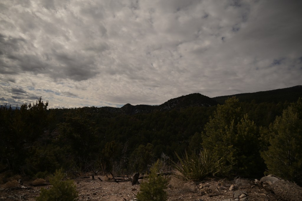
The first set of images were taken at 0 exposure compensation, meaning at the shutter time the camera determined was appropriate based on the light meter, given my specified aperture and ISO setting. In the original JPEG, the clouds are washed out somewhat and the trees are dark. With minor post-processing in Corel PaintShop Pro 2020, the clouds are given more definition and contrast while the trees are lightened, producing an ok image. The original RAW file (converted to JPEG in PaintShop Pro with no other processing) is worse than the original JPEG, with completely saturated clouds and an even darker tree foreground. After some of my attempts at post-processing, the image remains pretty terrible. Certainly, this result could be due to my ineptitude with post-processing, and a more experienced photographer could recover a nice image from the RAW file. On the other hand, the JPEG required only minor corrections at my skill level to produce a decent image. Point to JPEG.
JPEG, original 
RAW, original 
JPEG, post-processed 
RAW, post-processed
(shutter 1/1000s, aperture f/4, ISO 100, picture control neutral)
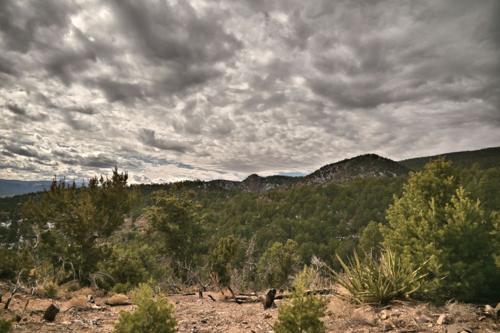
The next set of images were taken at an exposure compensation of ~-1.5, meaning at a faster shutter speed (shorter exposure time), resulting in an overall darker image. This value was selected manually, in order to visually obtain good contrast and brightness of the clouds, at the expense of creating a very dark tree foreground. (In the future, the on-camera histogram would be good to use.)
My first very frustrating observation is that the adjustments in AfterShot Pro and PaintShop Pro behave very differently, even though these two programs are made by the same company, Corel. Adjusting the “fill light” in PaintShop Pro brightens the trees and mountain, while keeping nice contrast in the clouds; in Aftershot Pro, the same “fill light” slider brightens the entire image, completely washing out the clouds. This is a terrible result, which I find very frustrating, since AfterShot Pro is touted on various reviews and forums to be a powerful RAW image processing software. As will all my efforts in this post, perhaps I am simply not using AfterShot Pro correctly; yet, surely I can’t be too far off the mark when the same adjustment in PaintShop Pro has incomparably superior results. Also this blog, though dated, seems to have found the same deficiency with AfterShot Pro. For now, I’ll leave AfterShot and continue all my further edits in PaintShop.
After one adjustment of fill light and clarity, the post-processed JPEG processed in PaintShop Pro 2020 looks quite nice indeed. The RAW image was also transformed into something decent in post-processing, but it took significantly more effort than the JPEG to adjust the color, hue, saturation, vibrancy, etc. Note when a RAW image is opened in PaintShop, the software first opens the RAW lab, which has a couple of possible adjustments. Compared to tutorials that work with RAW files in Adobe’s Camera RAW, the options in Corel’s RAW lab are limited. I believe (though have not been able to confirm) that once you move from the RAW lab to PaintShop, you’re no longer editing the RAW file anymore. Therefore, at this point, the edits I do in PaintShop to the RAW file and the JPEG are similar, I believe, just with a different initial starting point. Therefore, I do not believe I am exercising the power of RAW files when I’m working with them in PaintShop.
Finally, we must consider lens distortions. The lens I am using (Nikon Nikkor Z 24-200mm f/4-6.3) has significant distortions, which are corrected by the camera when it processes JPEGs, but which must be corrected manually when working with the RAW files. A recent update in AfterShot now has the lens corrections for this lens; however, the RAW lab in PaintShop does not. I can open a RAW image in AfterShot, apply the lens correction, then get the parameter values and manually type them into PaintShop. Possible, but certainly a painful workflow.
Given how nice the post-processed JPEG turned out, with much less effort, with lens distortions already corrected, point again to JPEG.
JPEG, original 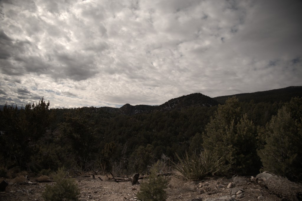
RAW, original 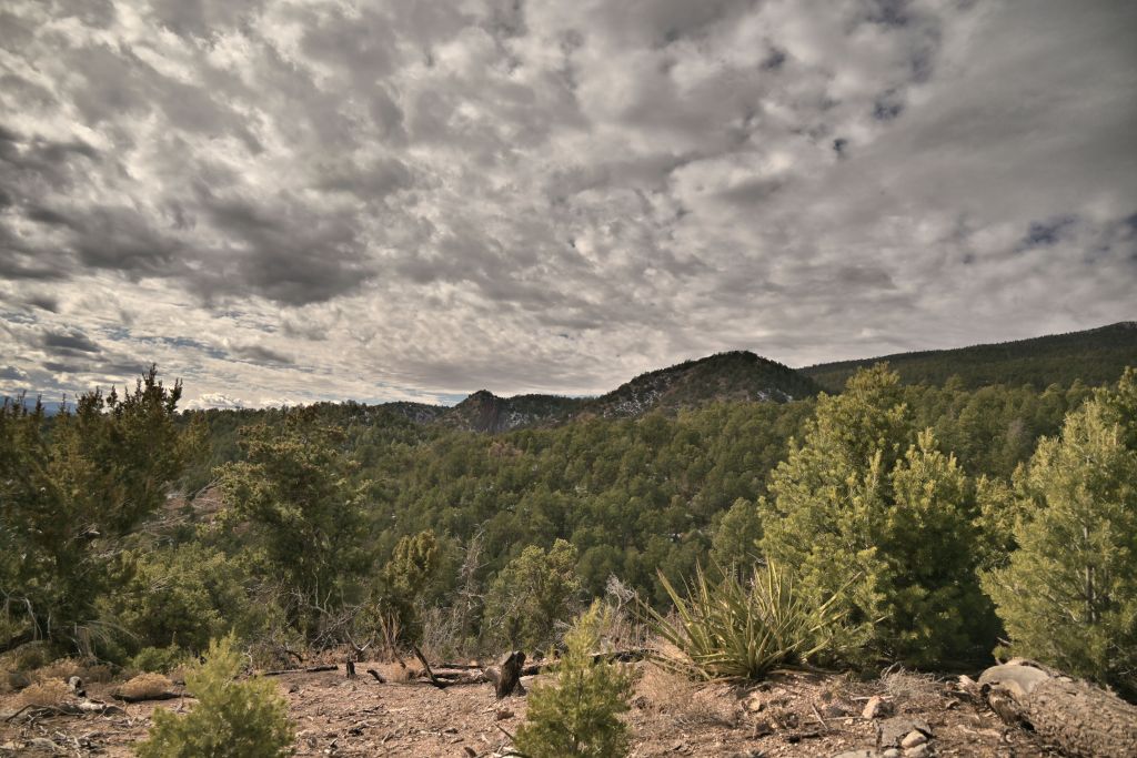
JPEG, post-processed in PaintShop Pro 2020 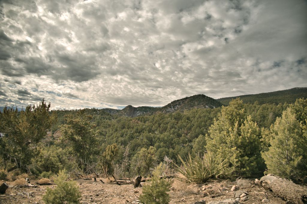
RAW, post-processed in PaintShop Pro 2020 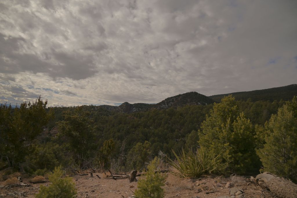
JPEG, post-processed in AfterShot Pro 3 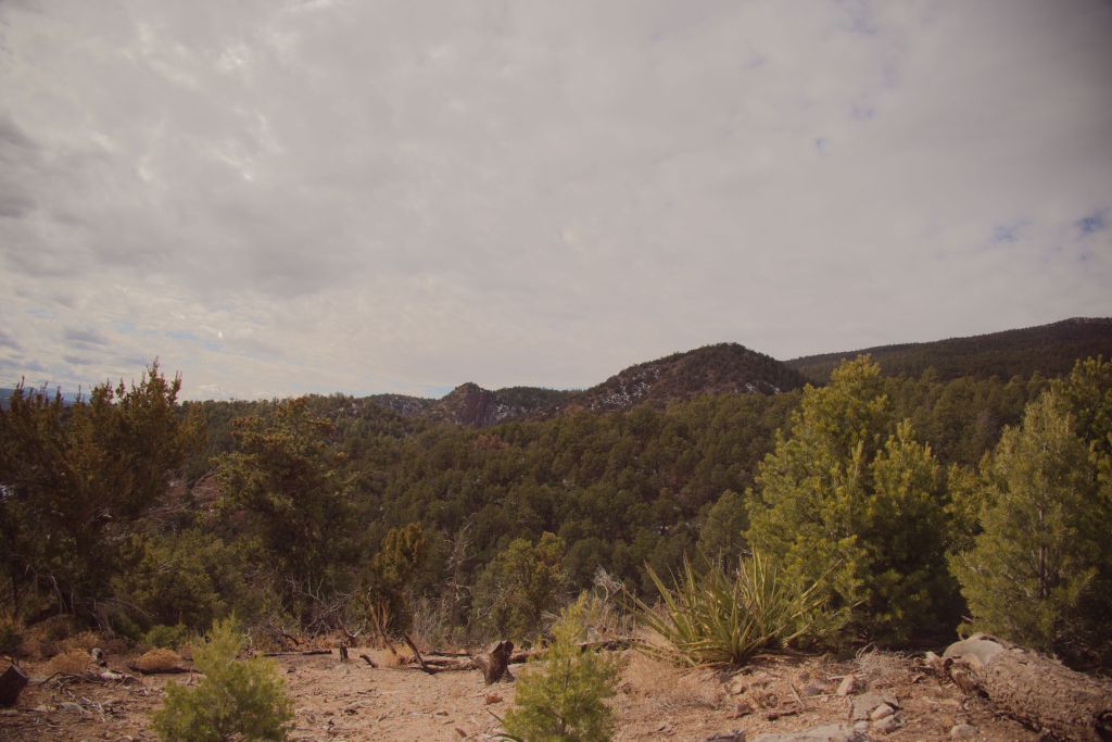
RAW, post-processed in AfterShot Pro 3
(shutter 1/4000s, aperture f/4, ISO 100, picture control neutral)
Two post-processed JPEGs from above are set side-by-side to compare exposure compensations of 0 (lighter) or -1.5 (darker) for the exemplar scene. Clearly, starting with the darker image leads to a superior post-processed image with better contrast and dynamic range. Again, these results may differ with an experienced photographer spending more time in post-processing, but for minimal effort, an inexperienced person can take an underexposed JPEG and end up with a decent image. Lesson learned: for scenes with a bright sky and darker land, I’ll aim to underexpose slightly.
Exposure compensation 0 Exposure compensation ~-1.5
Given the conclusions drawn so far (work with JPEGs, under expose the image), I explored the picture controls in more detail, to see which was most pleasing for our exemplar backyard mountain scene. All images were lightly processed in PaintShop Pro, with a quick adjustment of fill light and clarity to lighten the mountains while keeping the contrast in the clouds. More adjustments could always be made, but the idea here is to let the camera do the work so I don’t have to. If I can get a better feel for effects of all the picture controls using this systematic study, then I can select an appropriate one more quickly and confidently out in the field.
The first set of images shows the 8 picture controls that are polychromatic. For this scene, I liked Portrait and Pop the best, with Neutral and Standard being ok. Flat, Landscape, Vivid and Sunday weren’t my favorites. Based on this data, I’d chose Portrait as my default setting for this type of landscape scene.
Portrait 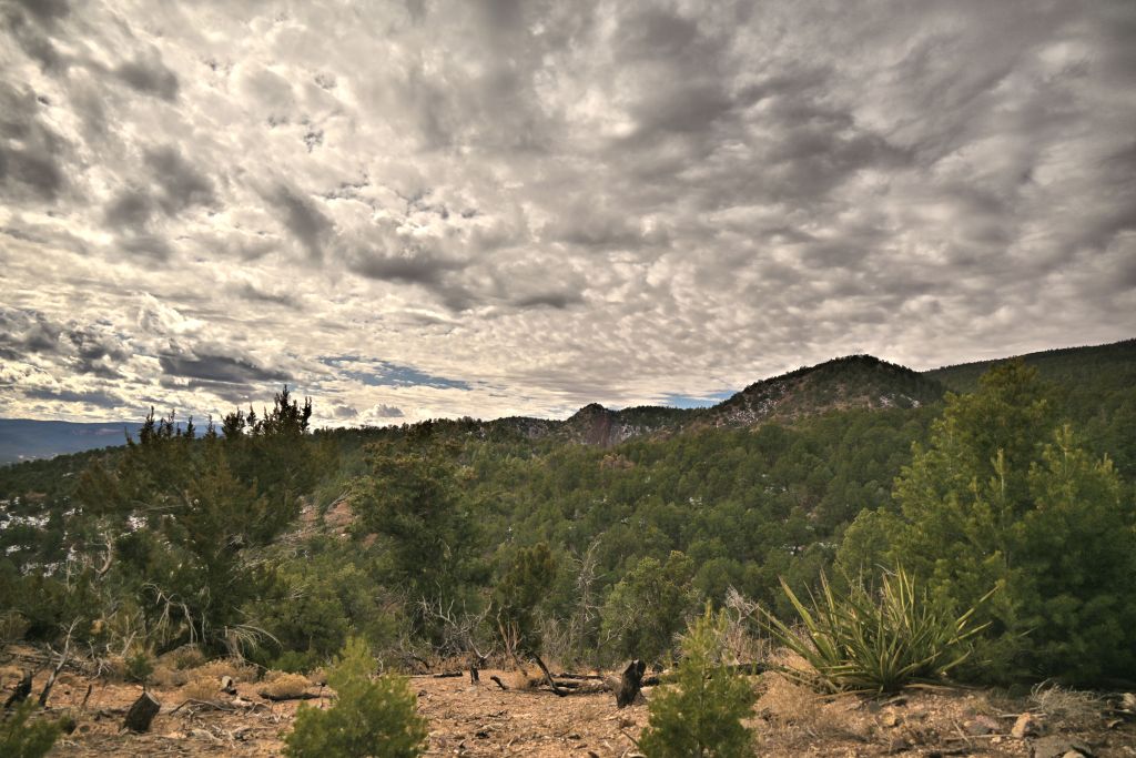
Pop 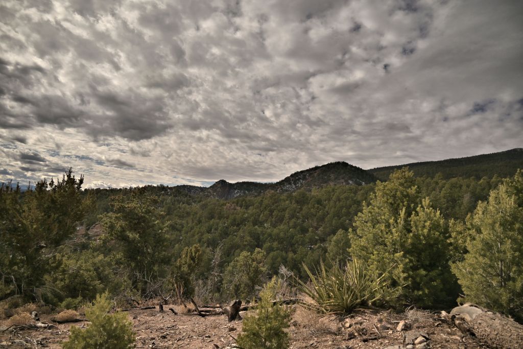
Neutral 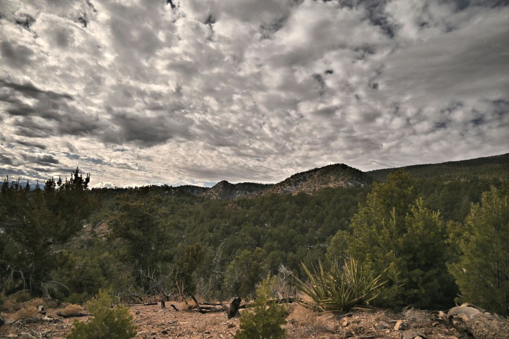
Standard 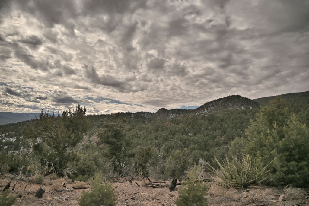
Flat 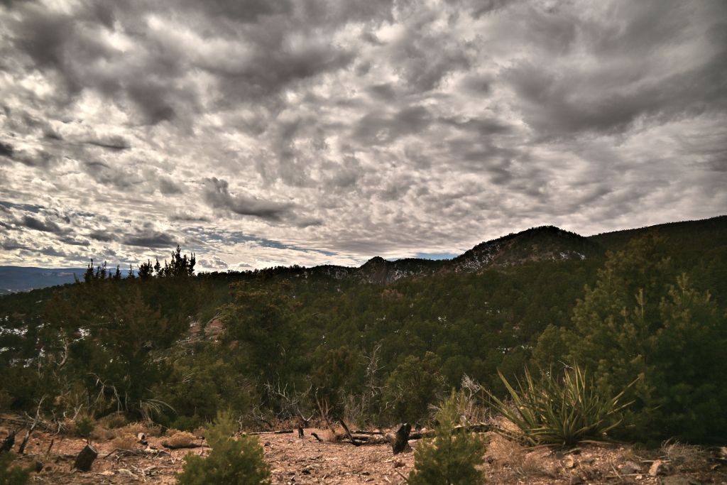
Landscape 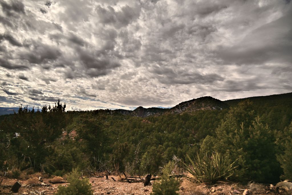
Vivid 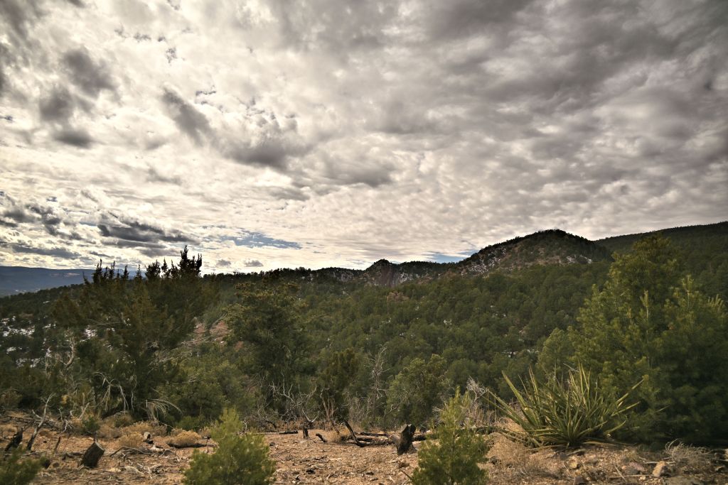
Sunday
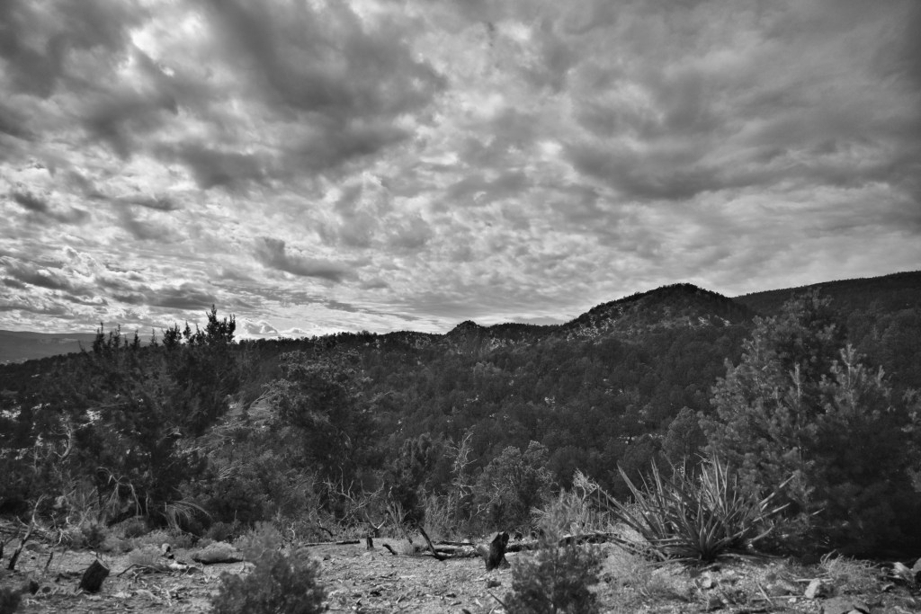
In the next set of images, I show the monochromatic or quasi monochromatic picture controls. Dream, Toy and Silence are pretty heavy filters that I wouldn’t want to use as a general default, but could be fun in certain circumstances. (Toy specifically I don’t particularly care for for landscape scenes, though anecdotally, it can be fun for Hercules.) Monochrome, Charcoal, and Sepia can all be nice schemes if you’re in the mood for it. But these images did make me wonder — can I select a default polychromatic picture control, and recover the monochromatic versions later in post-processing, and thus get the best of both worlds?
Dream 
Monochrome 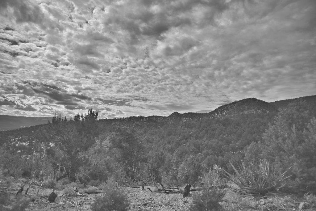
Charcoal 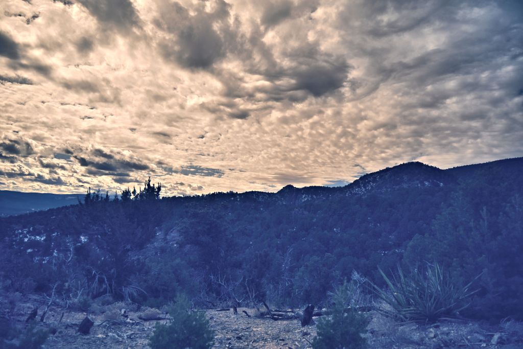
Toy 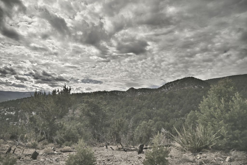
Silence 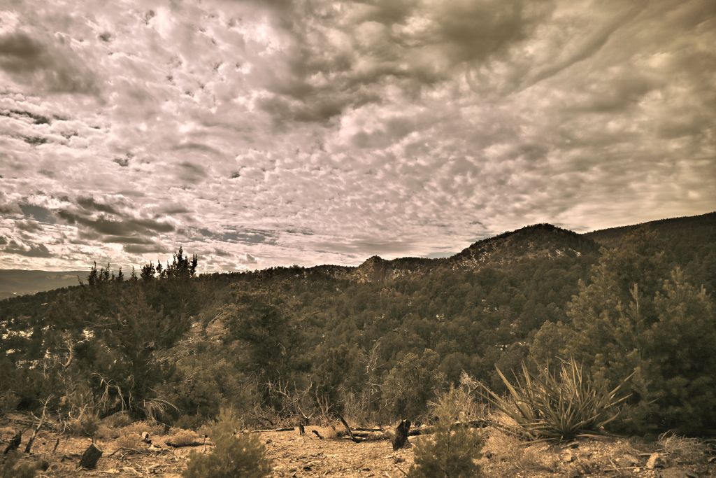
Sepia
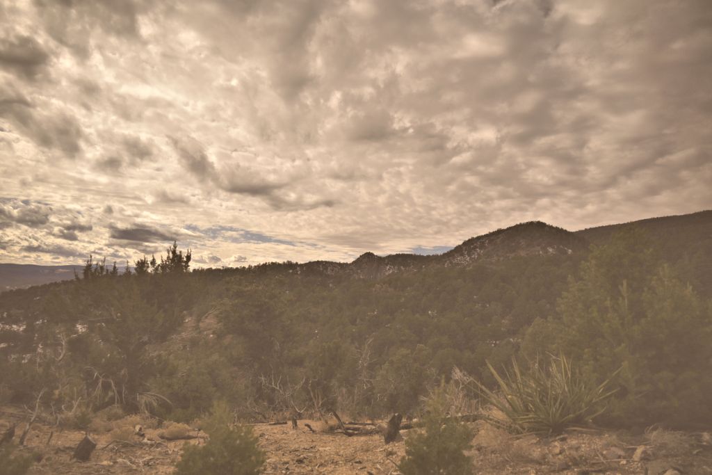
Thus we are brought to my final investigation with our archetype Sandia landscape. At this point in the day, I was becoming weary of working at the computer (as perhaps you are weary of reading this post), so this last analysis was brief. I started with the Portrait polychromatic image, and adjusted either the vibrancy or saturation to generate two different gray-scale images. I also created a sepia effect using either the built-in sepia photo effect in PaintShop Pro, or by manually adjusting the vibrancy and the green and blue curves. For the gray-scale images, I slightly prefer reducing the vibrancy over reducing the saturation, though both produce images that are comparable to the Monochrome or Charcoal picture controls processed on-camera. For the sepia effect, the photo effect in PaintShop Pro severely reduces contrast and degrades the image, in my opinion. There is only one effect adjustment “amount to age”, which I found insufficient to produce a nice sepia image. Manually adjusting the vibrancy and curves proved more promising, and this image could probably be improved with more tinkering. I still prefer the Sepia picture control on-camera, but it’s good to know that if I don’t commit to applying that picture control in the field, there’s likely a way to obtain a similar effect in post-processing.
Saturation -100 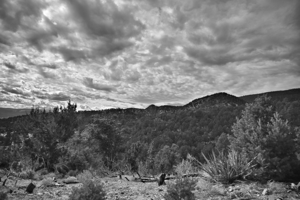
Vibrancy -100 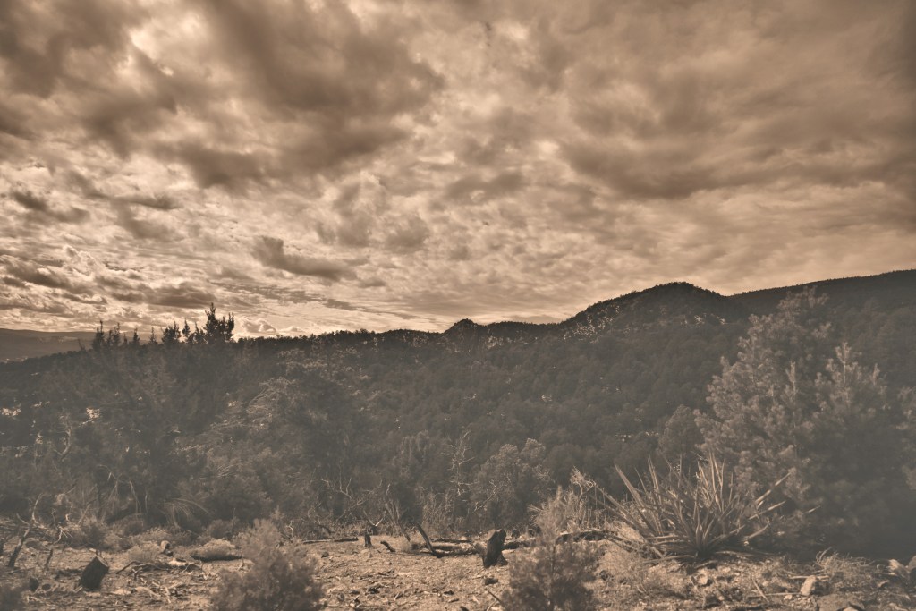
PaintShop Pro sepia photo effect 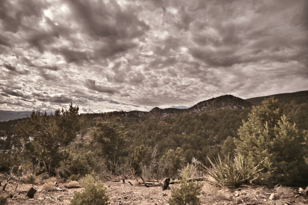
Manual adjustment of vibrancy and curves
That concludes this episode of rigorous investigation of file format, picture controls, and basic post-processing. Based on these results, I will be working predominately with slightly underexposed (at least in cases with a bright sky and dark land) JPEGs processed on-camera with Portrait picture control. Based on sage advice, I’ll go ahead and save the RAW files (as long as frame rate and storage space aren’t concerns) so that future-me, who is perhaps more discerning and simultaneously better at post-processing, can go back and really tinker. Current-me, though, is happy to let the camera do most of the work.
