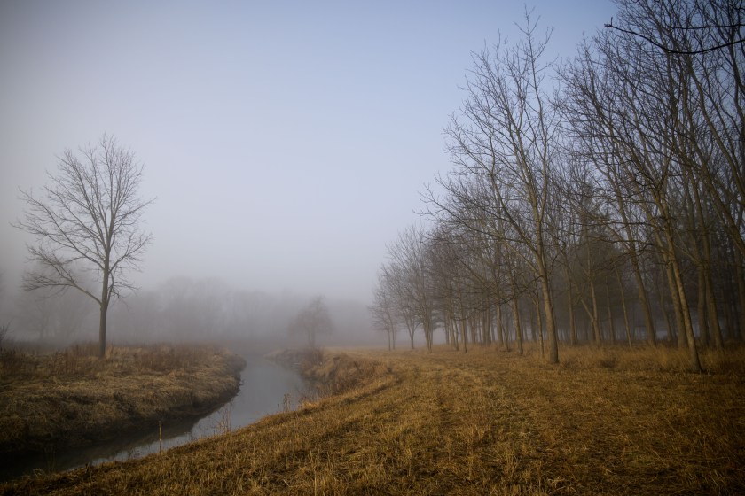
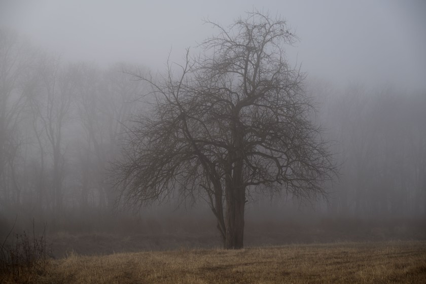
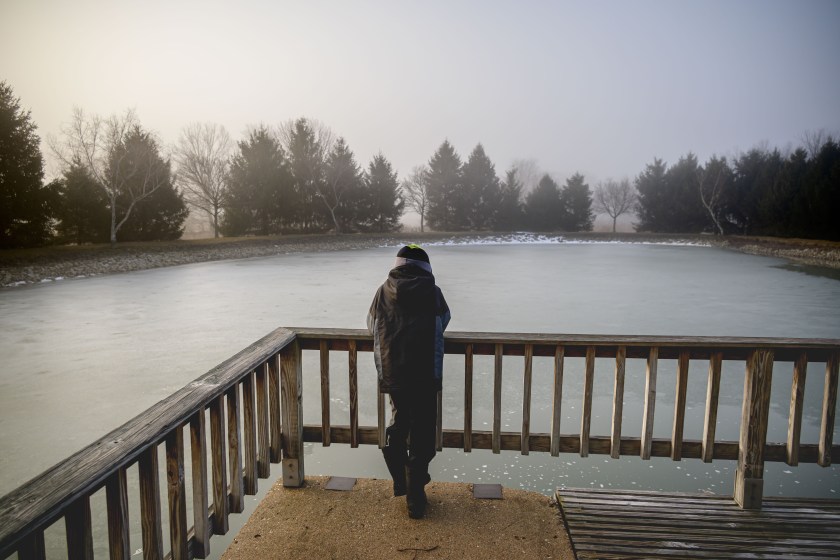
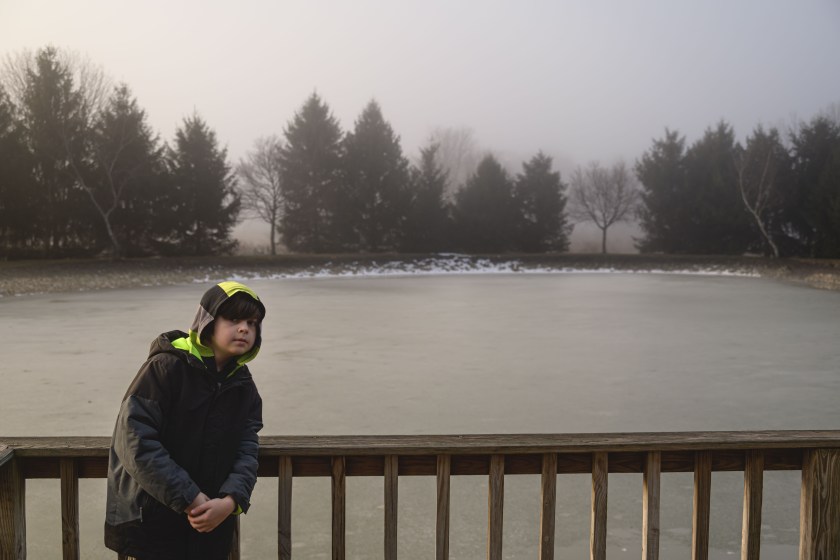
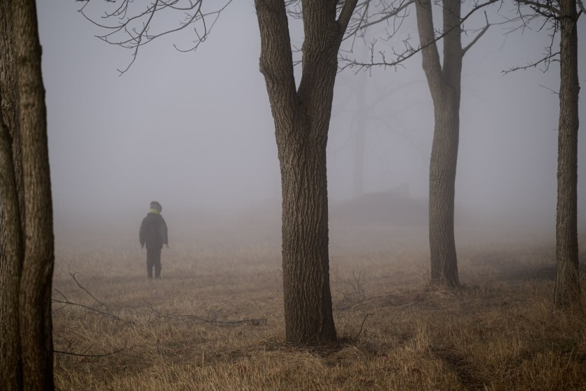
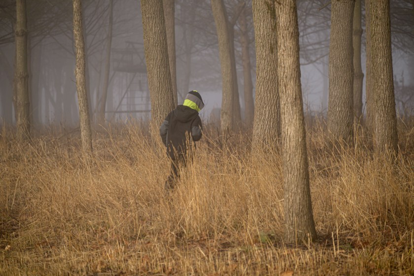
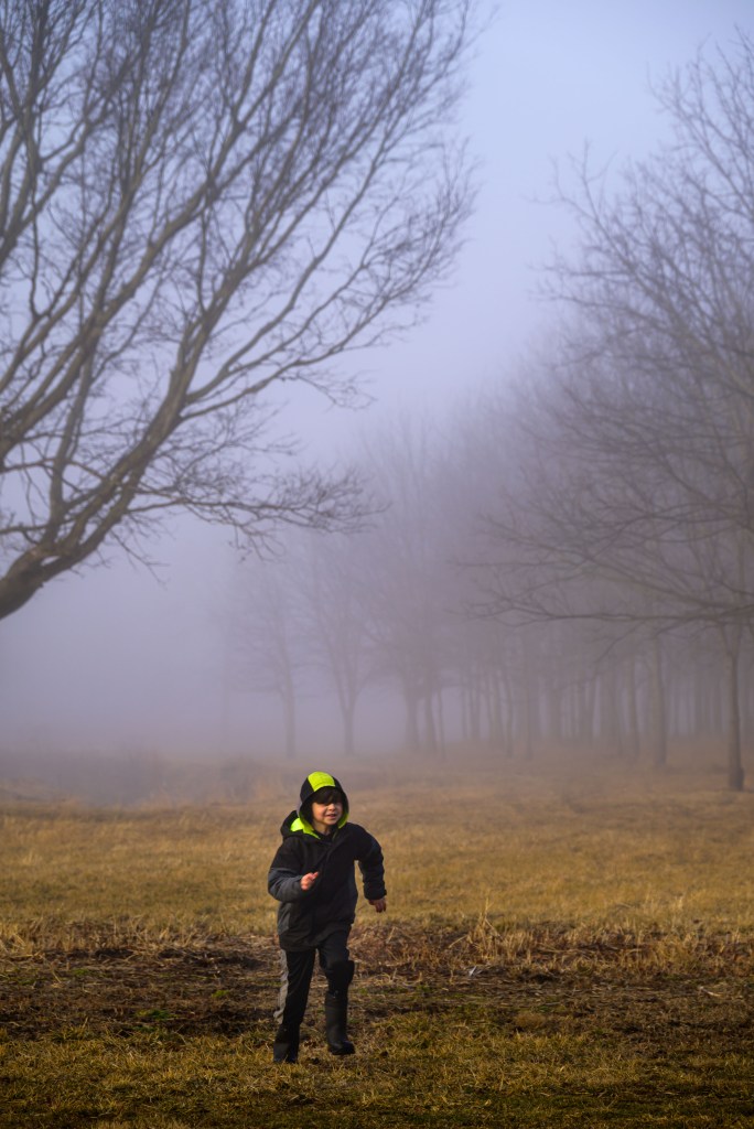
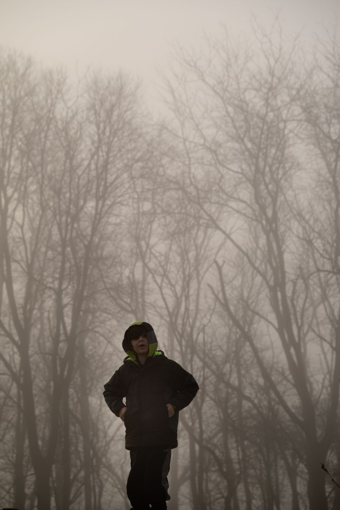
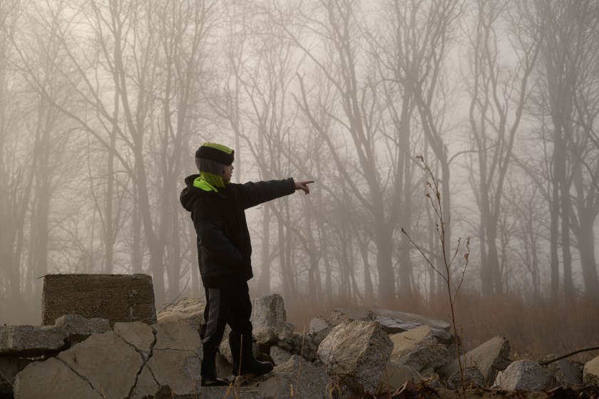
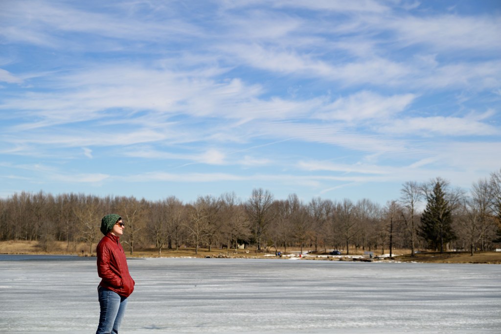
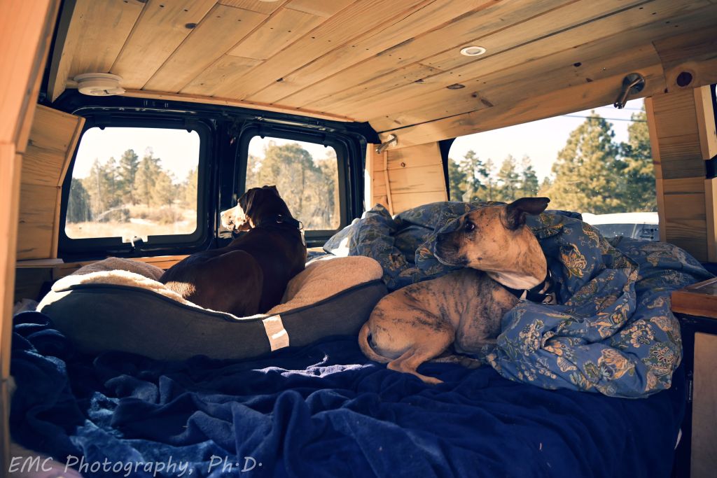
While back in Illinois, I went for a walk around the yard with my nephew on a foggy morning. He directed some of the shots, posed for others, helped me carry Dad’s tripod (for awhile at least), and in general told me stories explaining what we were exploring.
From a photography point of view, it was challenging to get the contrast and shadows I wanted for the dark trees in the background, without silhouetting S-. I tried my hand at some gradient filters in Camera Raw to adjust shadows, blacks, highlights, and whites independently around S- versus the background. I’m fairly pleased by the ones of S- on the dock; the ones of him running towards me and standing on the wreckage could use some improvement.
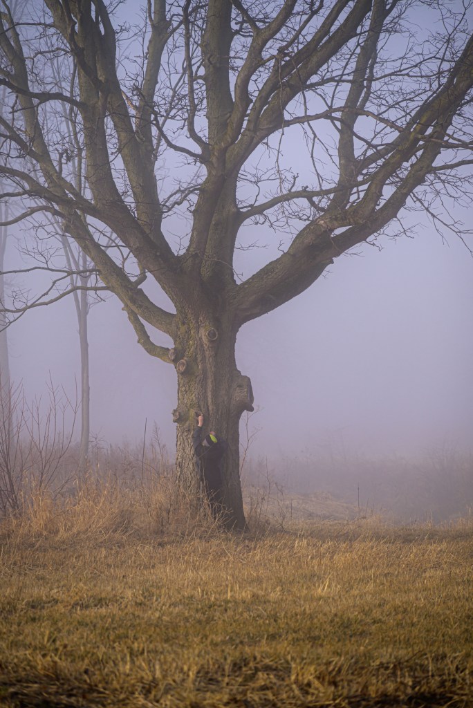
The pile of concrete, I was informed by S-, is the “wreckage”, the rubble leftover from a building that was torn down in the 60s. Or is it the remains of a concrete airplane, as Dad suggested?
After a year and a half of not seeing my family, I reached a tipping point for me personally where the potential travel-induced increased risk of COVID19 outweighed the realized negative impacts of missing my family. So I impulse-bought a plane ticket for two days later to fly back to Illinois. Then I waited 5 days through 4 flight cancellations and reschedules while 3 snowstorms passed through each of the airports I was supposed to fly through. Luckily, all that happened while I was still at home, and at least I wasn’t stuck in an airport. Finally, I managed a smooth flight back to Illinois.
Boss Lady
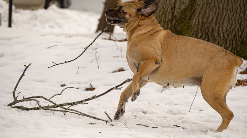
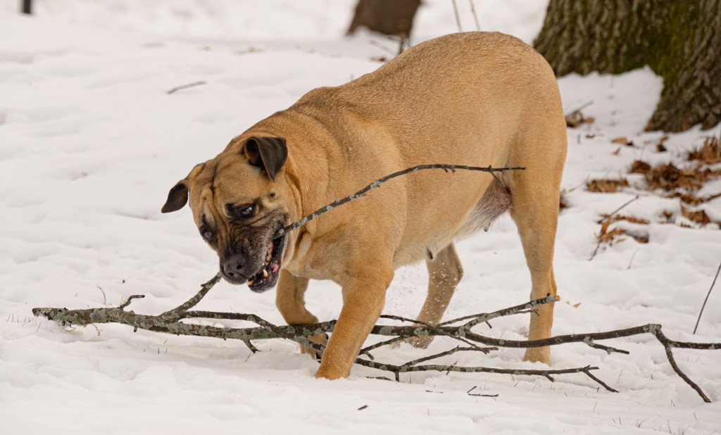
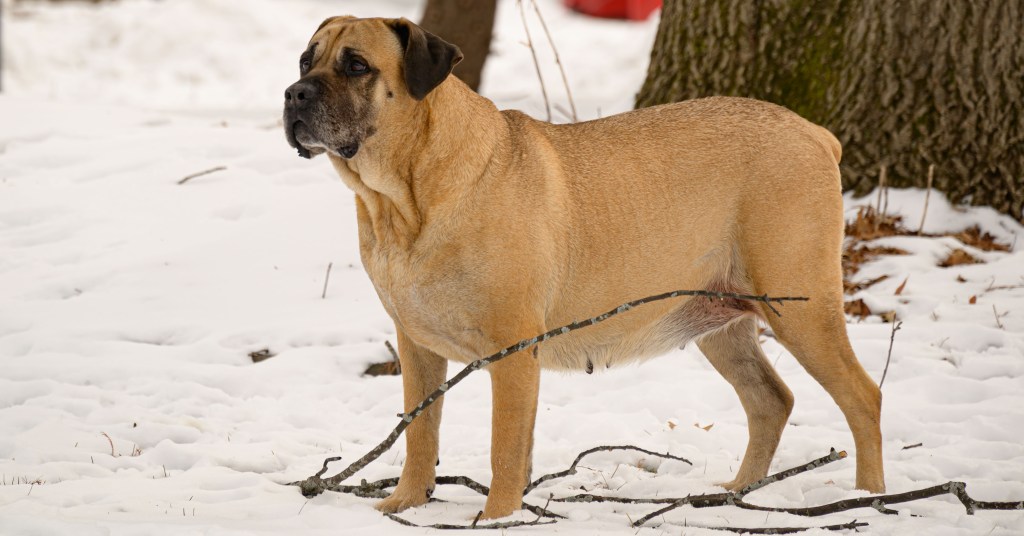
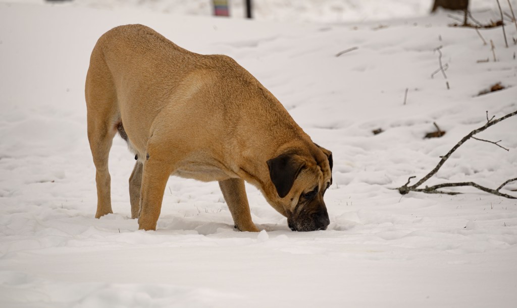
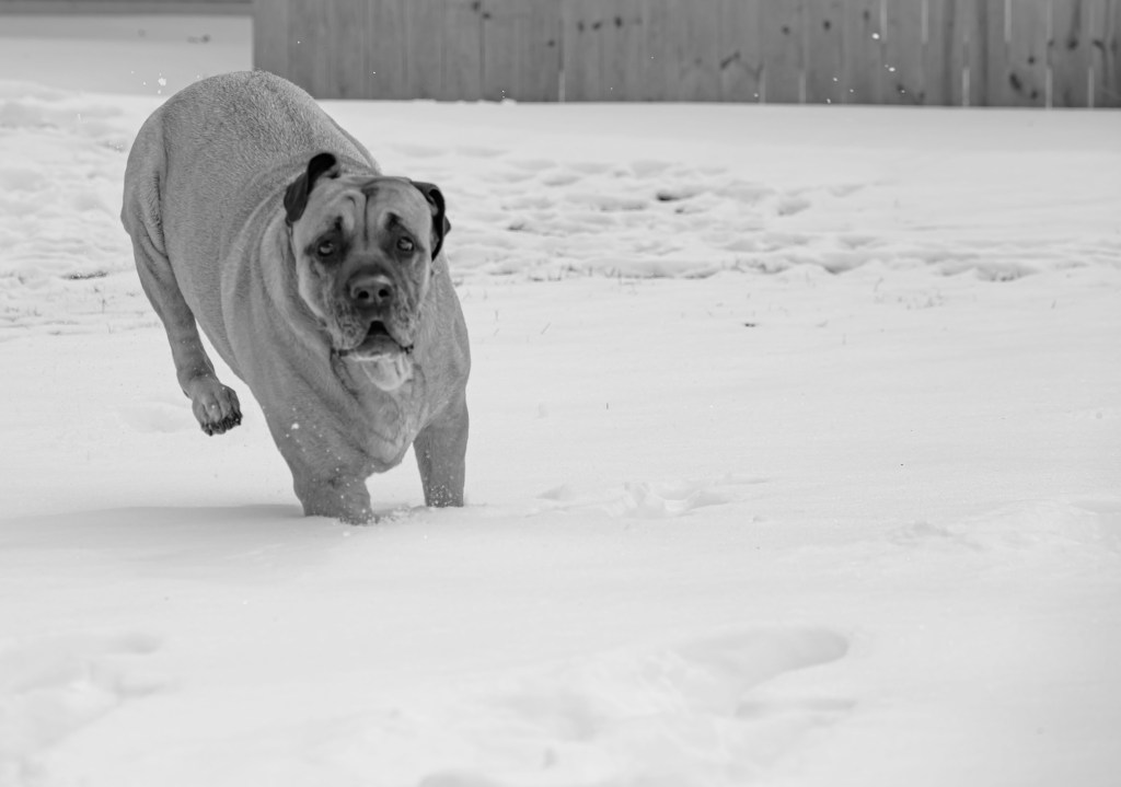
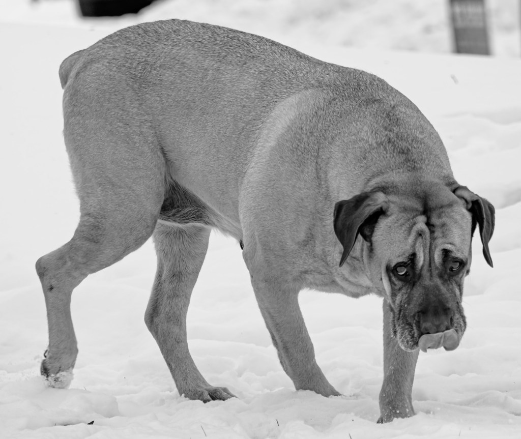
The first two days, I hung out with Meredith, Jonathan, and Lady, a Presa Canario mastiff. Lady—Boss Lady to be more accurate—is the sweetest pup ever. She loves pets, and if you stop too early, she will put her paw up on your arm, gently but forcefully soliciting more pets. She did a lot of laying around, but got frisky for a bit of stick chewing in the yard.
Lady playing in the snow
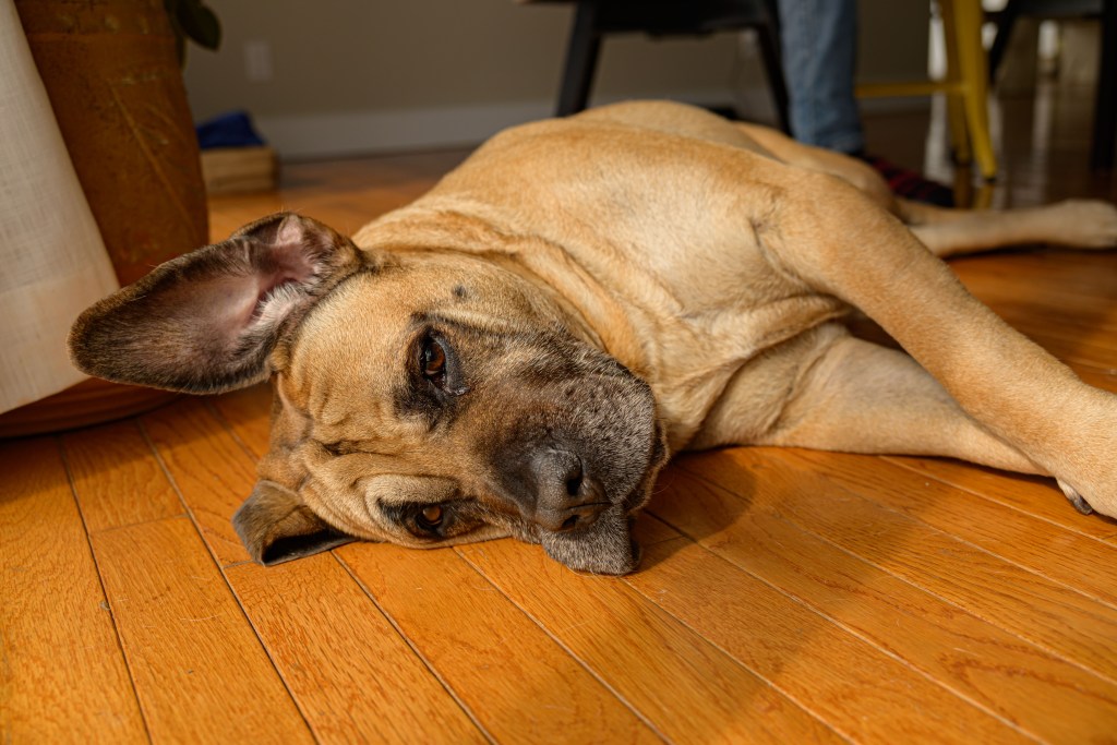
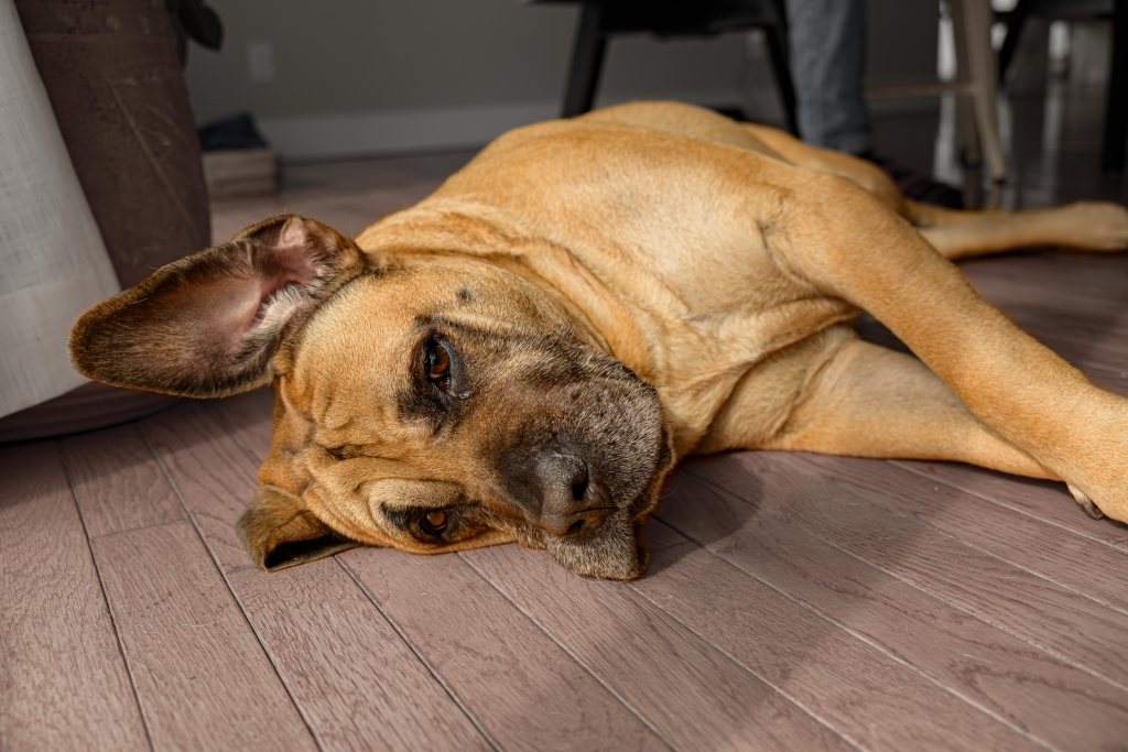
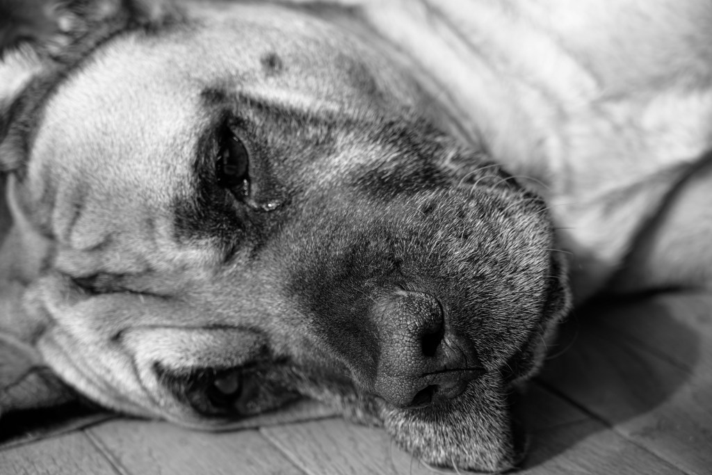
I thought the image below was a good one of Lady, but I didn’t like how the floor seemed to stand out as much as if not more than Lady. I ventured into Photoshop for the first time, to see what I could do. Don’t zoom in too far here—I need to improve my selection technique—but from afar, I like the effect.
My first foray into Photoshop doctoring, to reduce emphasis on the floor and instead highlight Lady
Lady is quite photogenic. M & J—Let me know if you want any of these; I can give you the raw files for your own professional editing.
Boss Lady
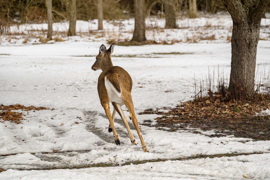
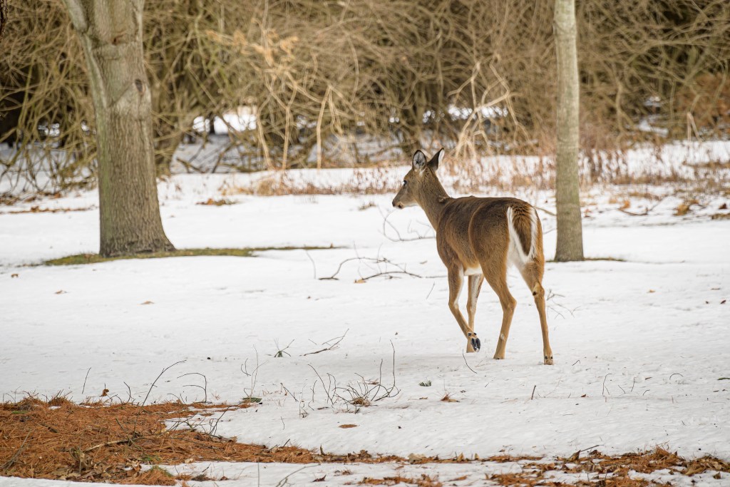
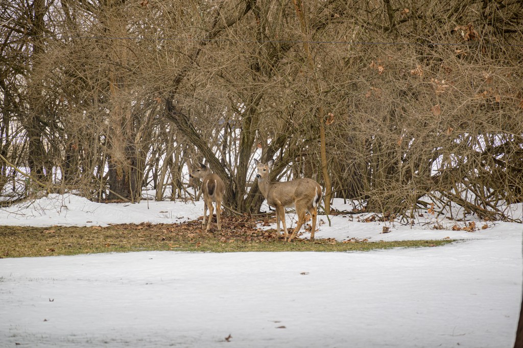
Deer
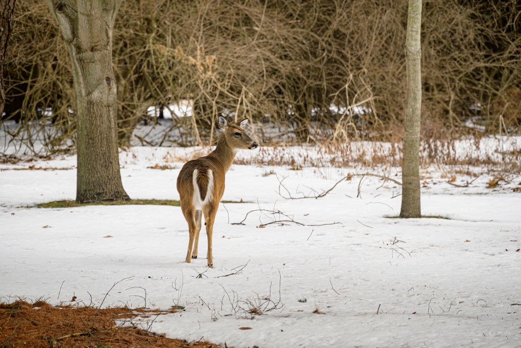
Mother and Dad have a family of deer in the yard, plus regular visitors from a larger herd. I forgot how much fun it is to watch them through the windows as they go about their day.
Deer in the yard
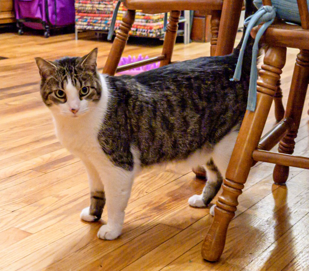
Ernie and Georgia
Paula and Mike’s cats ran away from the camera, so I didn’t get many pictures of them, but here are two to show them off a little.
Ernie (left) and Georgia (right)
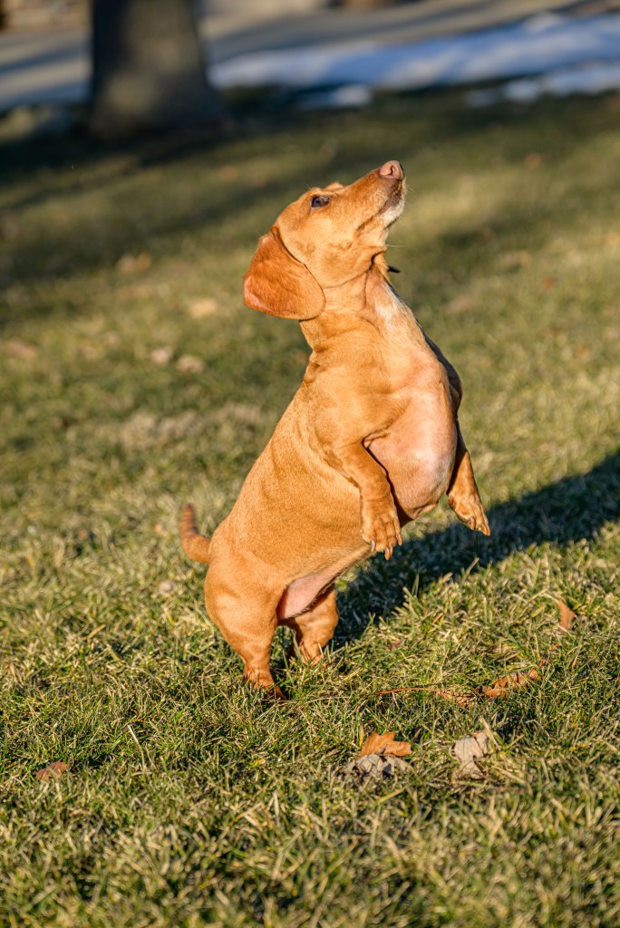
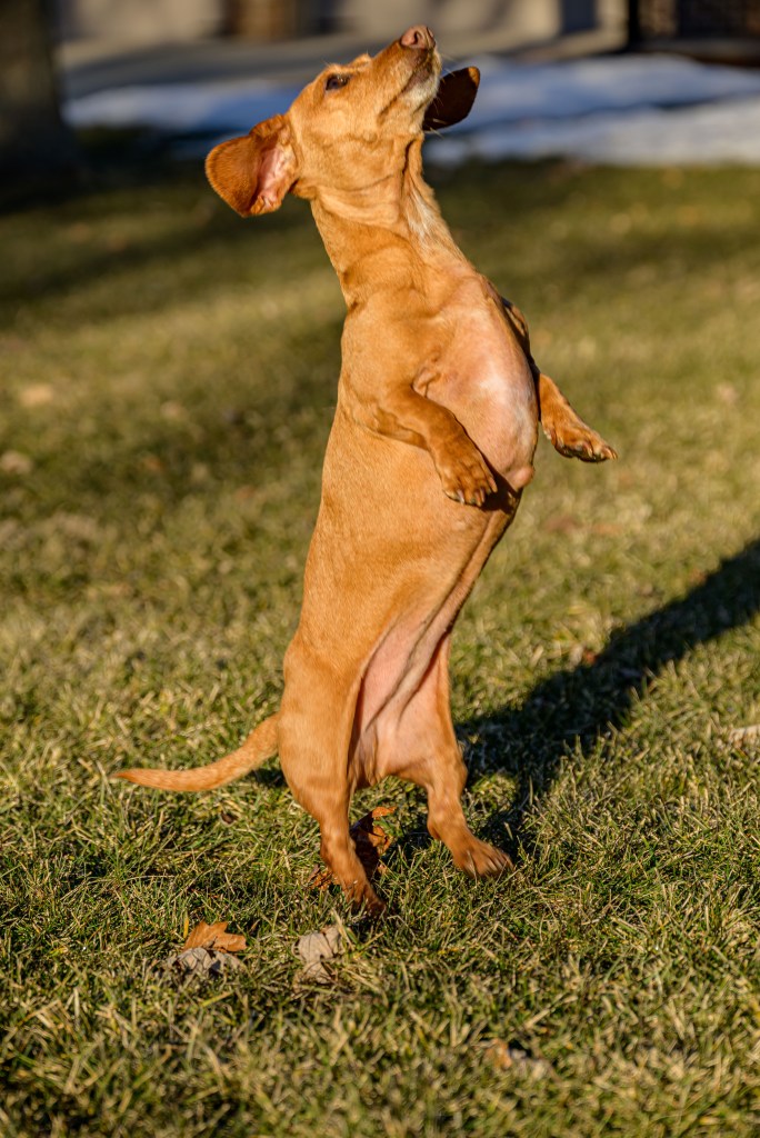
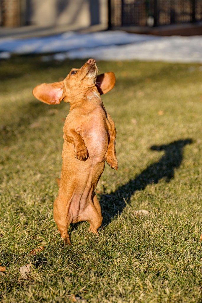
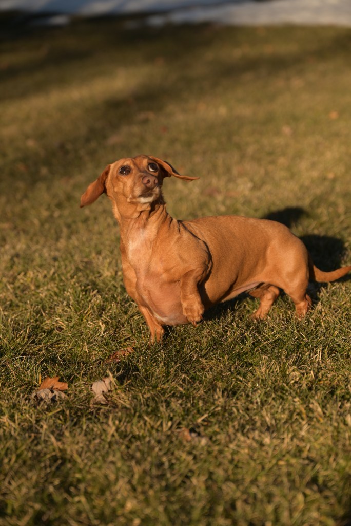
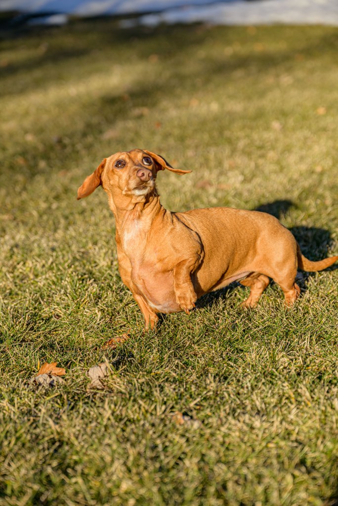
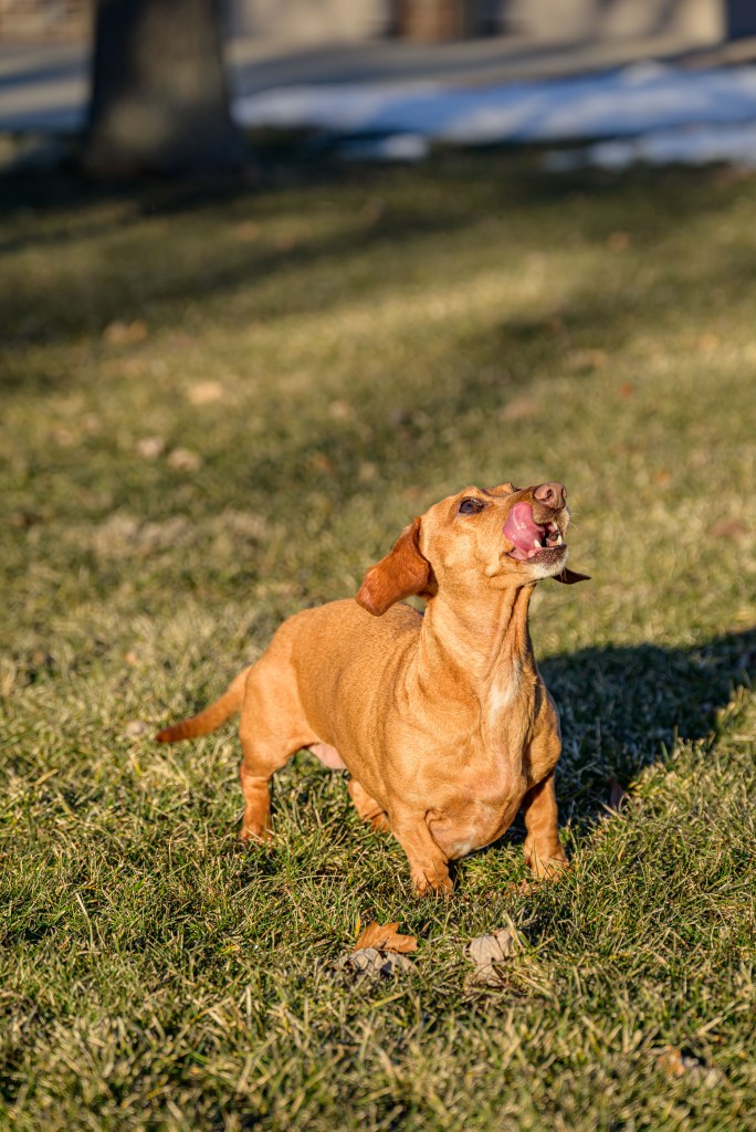
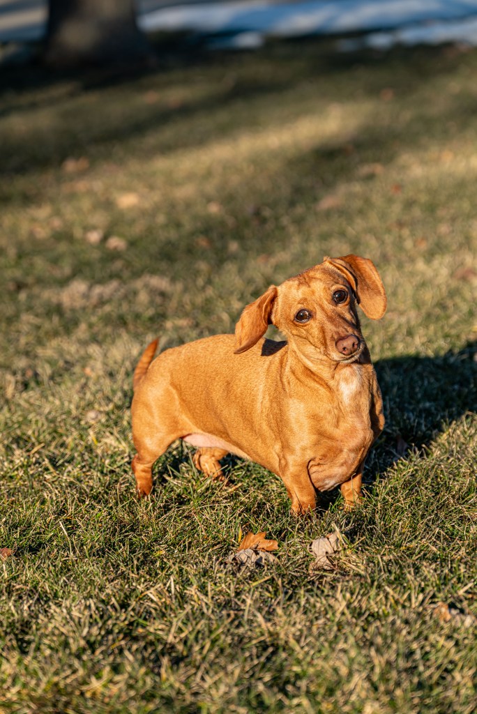
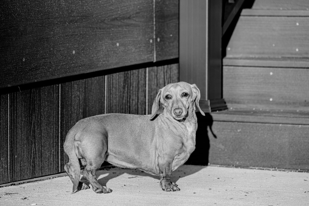
Piper Sue
Piper, on the other hand, is happy to be photographed. Dad assisted with some nuts. The main goal was to get the classic Dachshund position with one paw raised solicitously, but first we got some solid straight-up jumps in the air.
Heading up
Nut!!
Coming back down
Piper begging for a nut from Dad
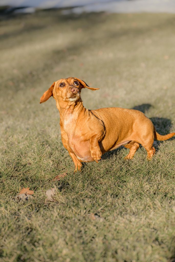
Finally, we got one photo with the classic pose. I used the same technique as with Lady to emphasize Piper and mute the background. Again, don’t zoom in too closely. I’m still evaluating if I like it or not—it might be doctored to the point of looking overly fake—but I learned some more Photoshop basics working on it, so it’s a win for that if nothing else. And in case you didn’t get enough earlier about RAW vs JPEG, I tossed in the camera JPEG here for comparison to the edited RAW image, too.
Camera JPEG
Edited RAW
Photoshop funsies
My first foray with Photoshop (repeated here with Piper, following the technique used for Lady)
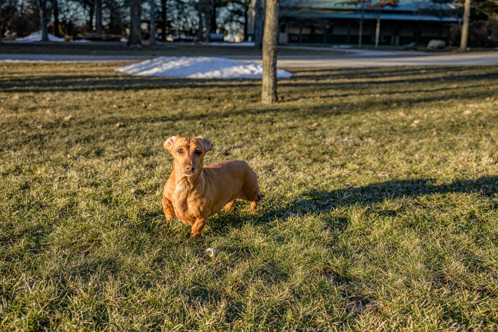
Piper Sue took several more good photos, so here are a few more of this little doggo.
Piper Sue
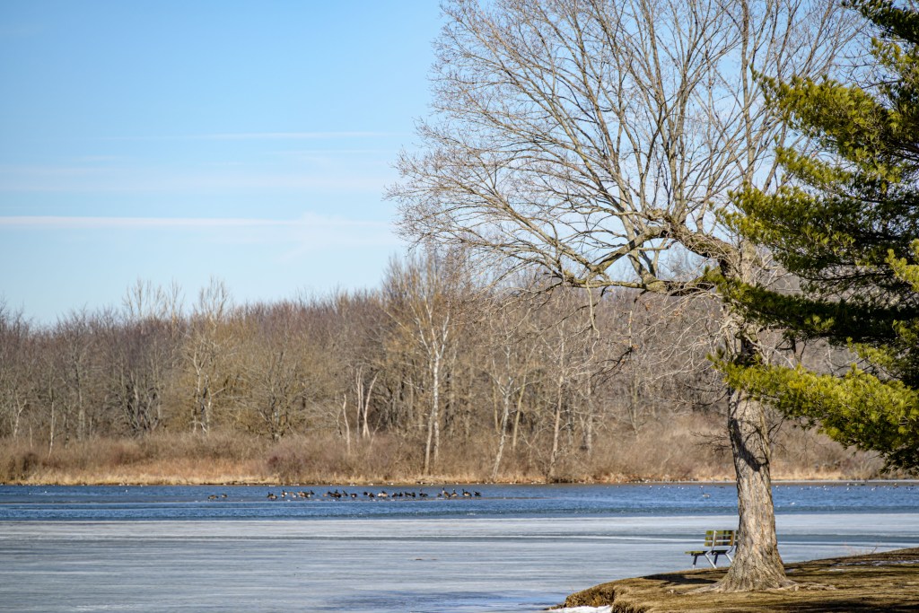
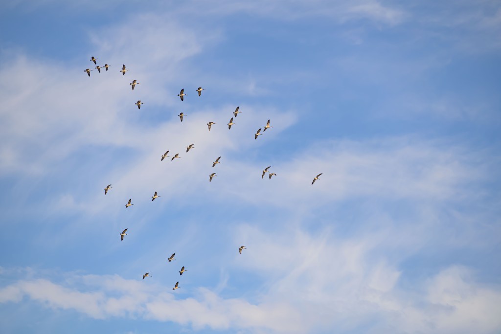
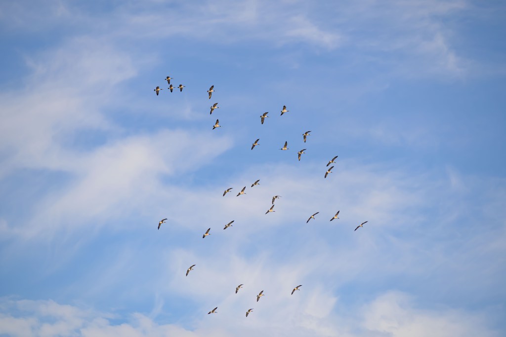
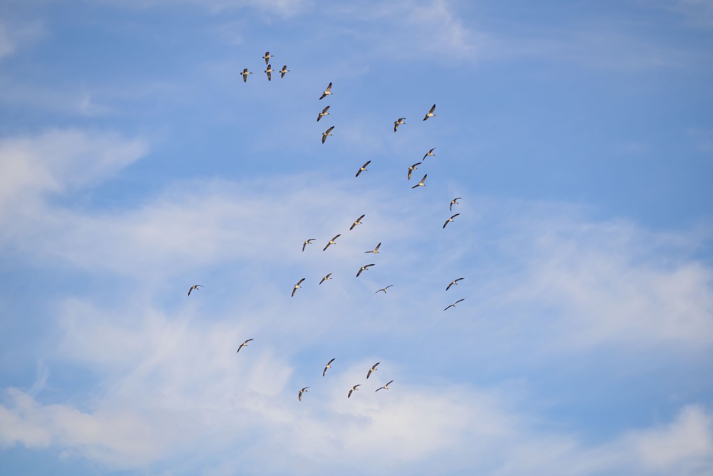
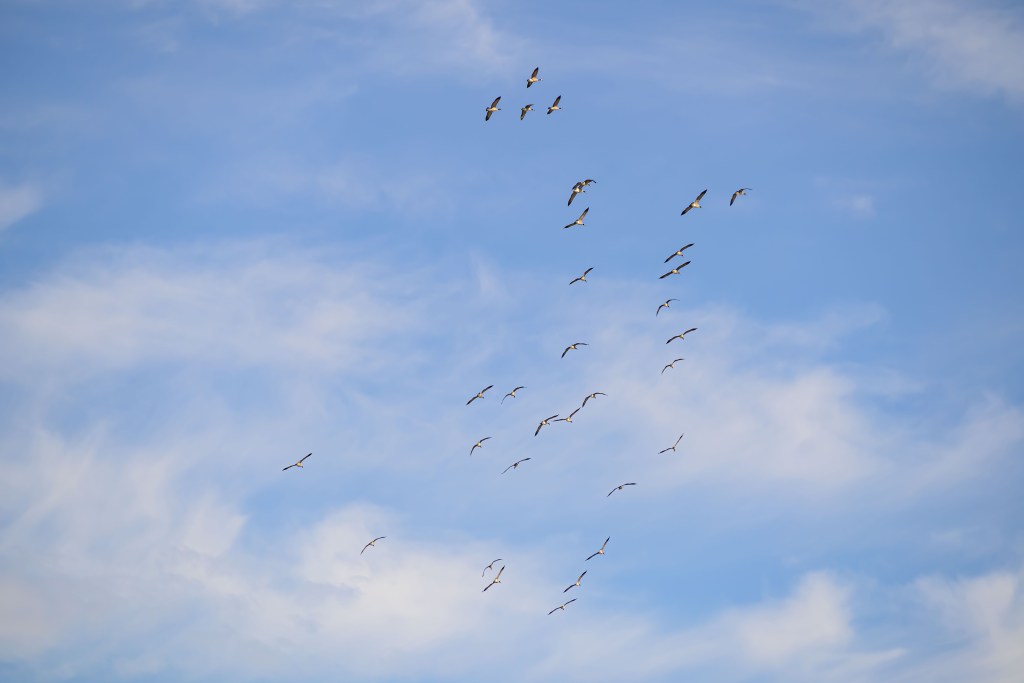
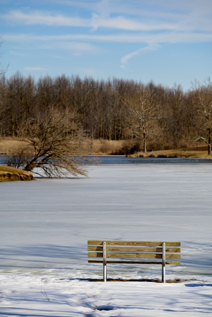
Homer Lake
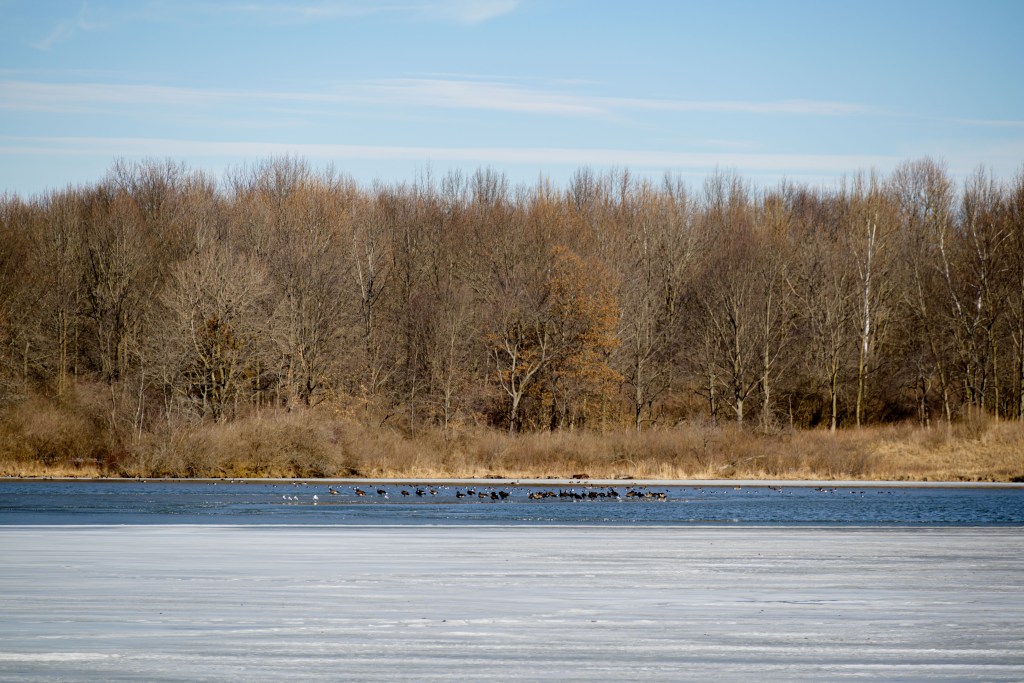
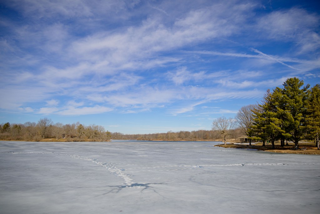
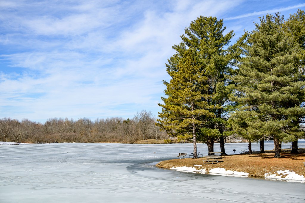
Paula and I debated for about 30 seconds if we wanted to go for a run or just walk around Homer Lake and take pictures. The latter won.
Homer Lake
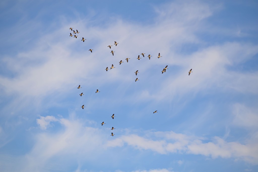
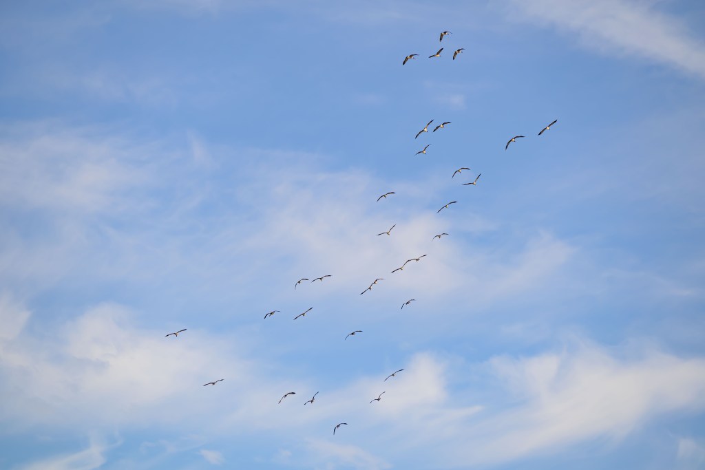
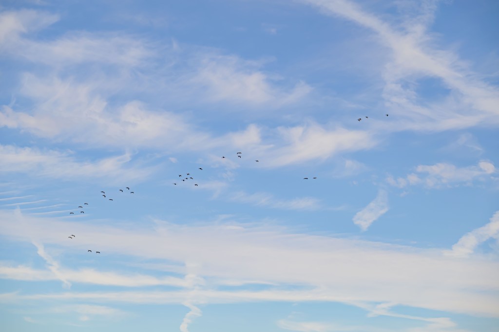
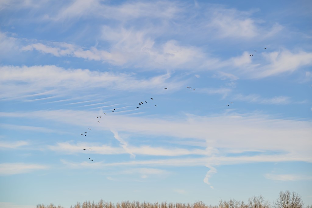
Flock of geese
Homer Lake
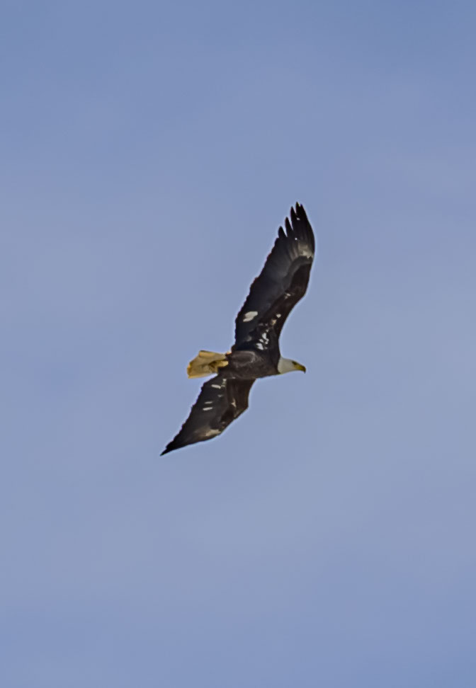
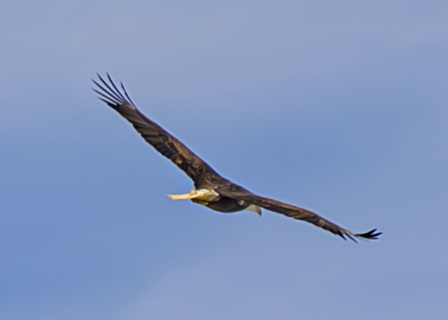
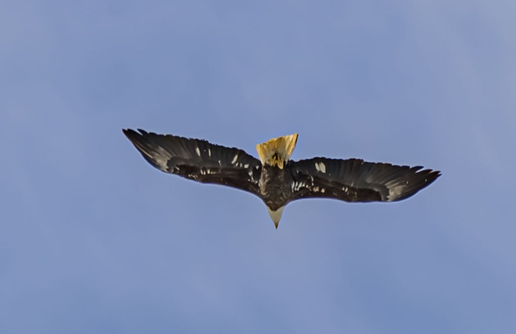
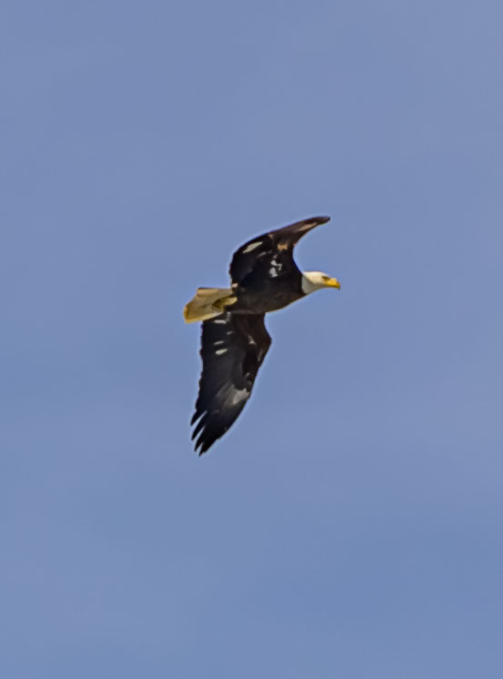
An eagle flew arrived in the distance while we were there. I tried to get some shots of him, but he was pretty far away and I couldn’t zoom in as much as he deserved. Here are a couple of the images I did manage.
Eagle at Homer Lake
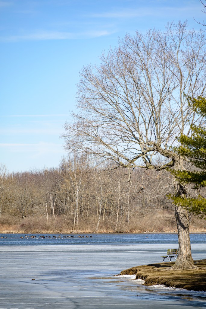
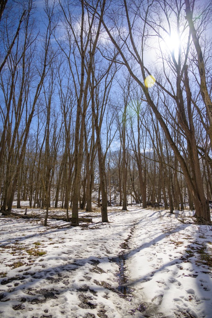
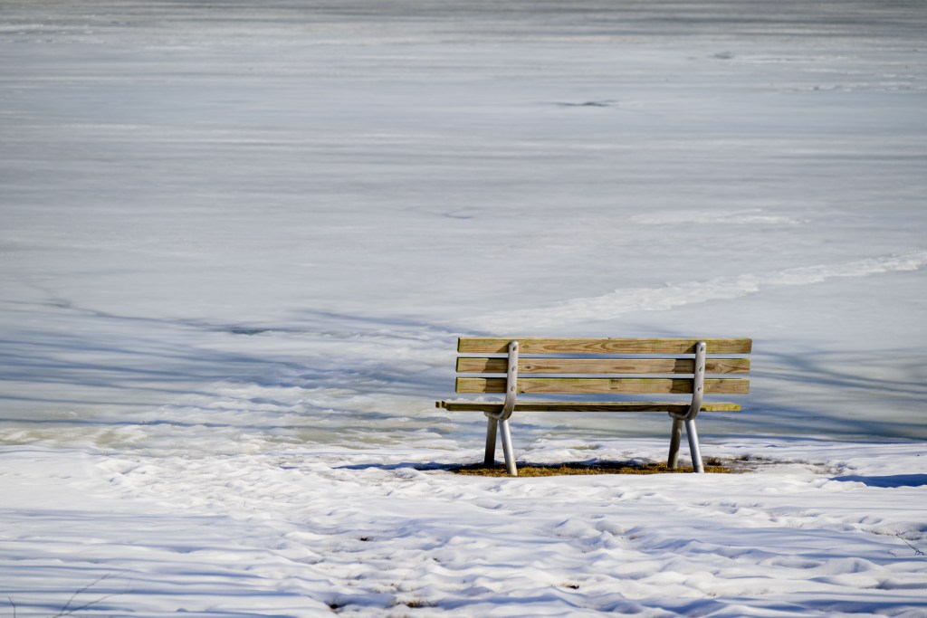
We did a little walking on the slushy trail and got down to the Salt Fork. Overall, Homer Lake is such a pretty park. I love getting over there any time I’m back in Illinois.
Homer Lake and Salt Fork River
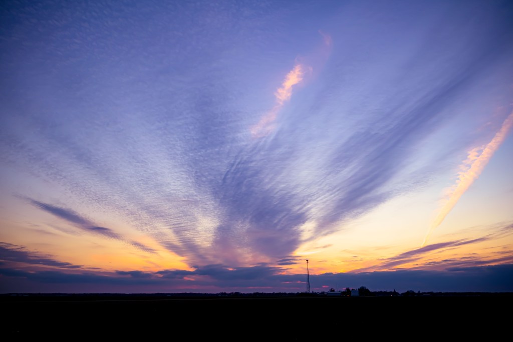
Sunset
On the way home from town, a pretty sunset was happening, so we pulled over the side of the road for a quick shot. Not shown here is the fact that we were coming from Grandmother and Grandpa’s house, where we found—and donned—my mother’s 8th grade graduation dress (ca. 1960s) and the dress my Grandmother wore to my uncle’s wedding (ca. 1970s). Just picture that—two gals in dresses 50+ years old, with hiking boots, pulled over on the side of a country road, taking a picture of this pretty sunset.
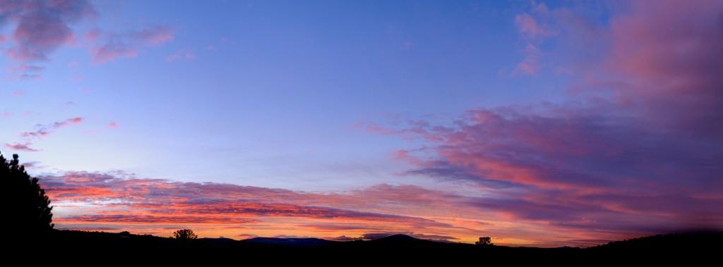
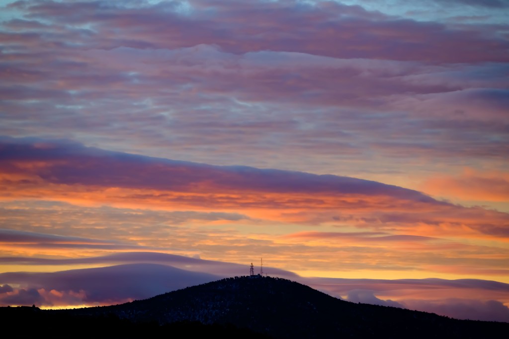
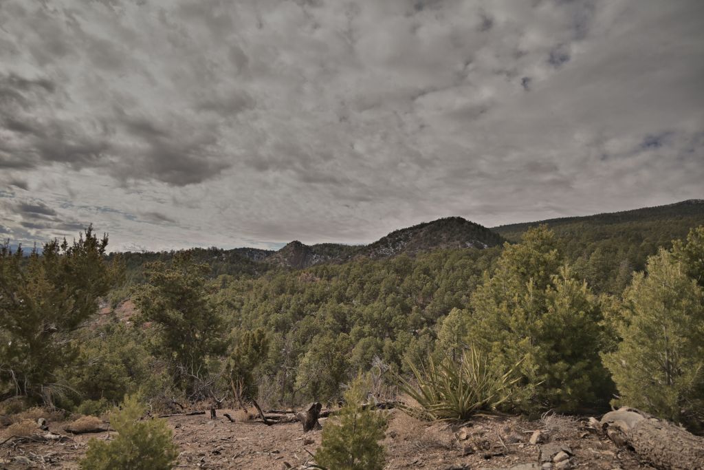
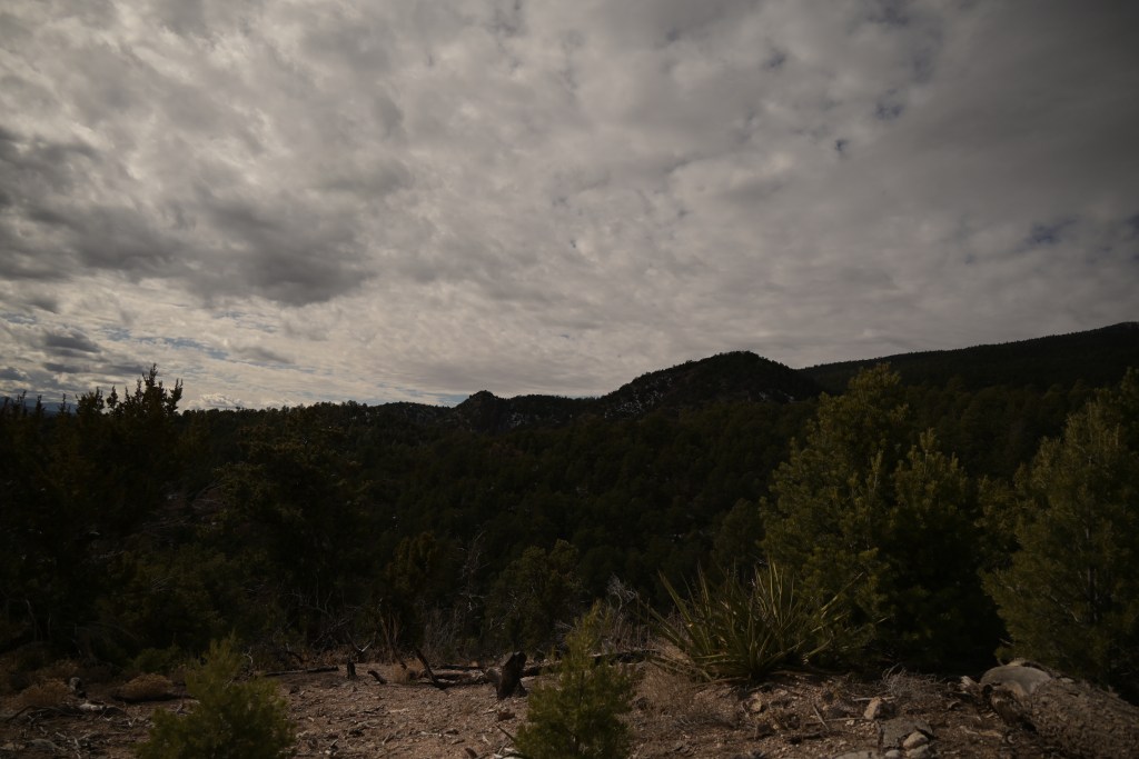
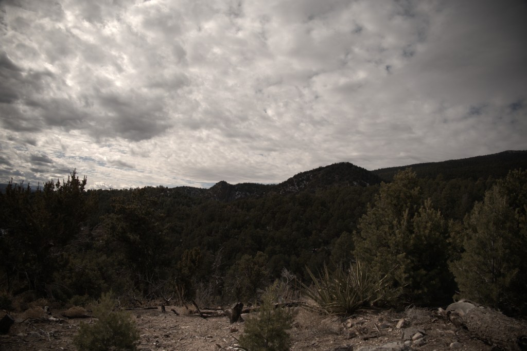
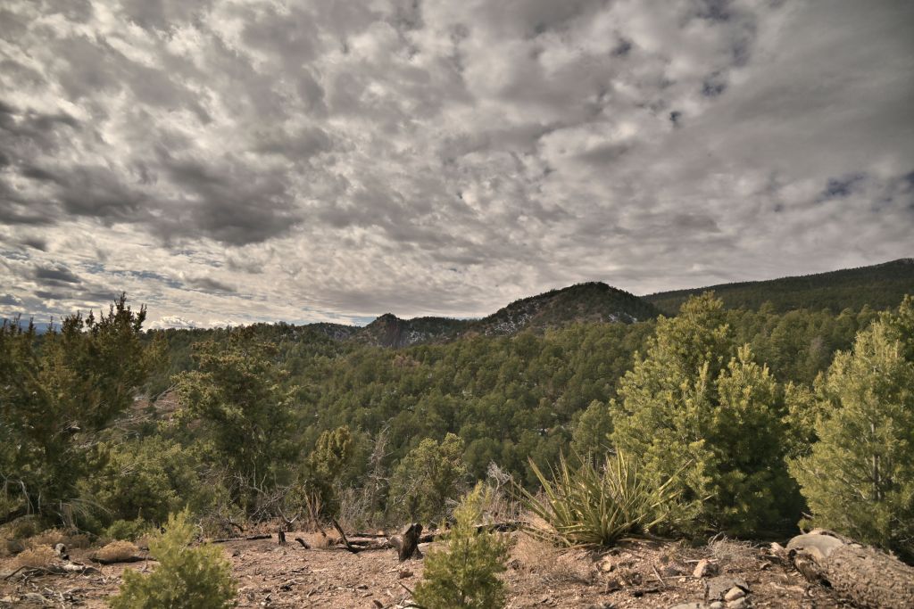
Just as I was getting ready for work one morning, I glanced out the window and saw a peek of a beautiful sunrise. So I slung my camera bag over my shoulder, climbed up Lucrezia to get onto the roof, and tried to capture the sunrise. After a little editing in Camera Raw, I think I got something worth sharing here.
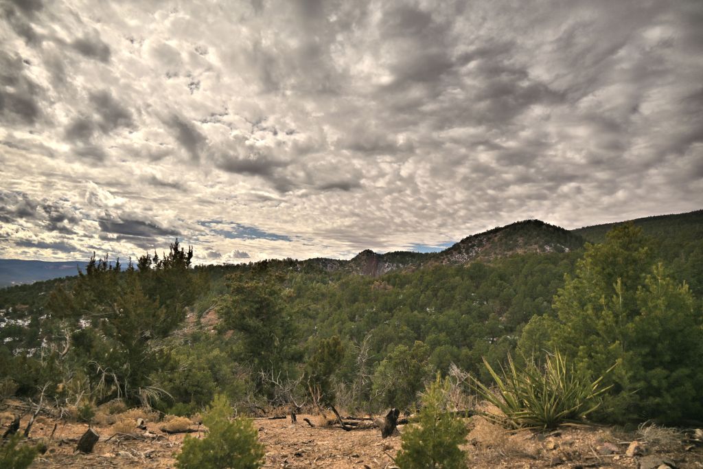
UPDATE (2021-02-26): After some subtle suggestions from Uncle Jerry, I worked more on my image noise. Check out the close-up of Cedro Peak—much smoother now. I don’t love how the Cedro towers turned out—wished they were crisper—but you can only do too much with a photo when you’ve only got a few pixels across a feature.
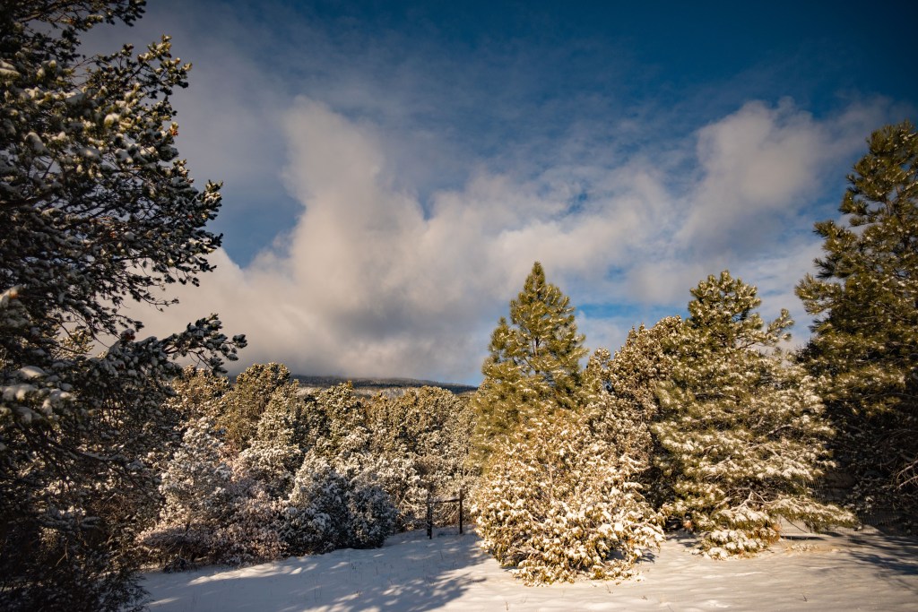
We had a nice snow fall, and I took a minute to capture some quick pictures of the snowy yard and mountain background.
January snow
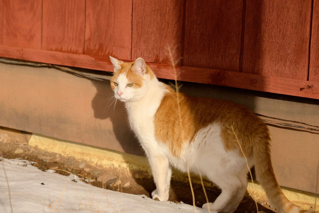
The pups enjoyed a little running around, before Hercules got cold and went inside. I finally got an ok picture of Cheech while he was hugging the wall of the house trying not to step in the snow.
Lab notebook entry 2. I continued to agonize more over the RAW vs JPEG situation. I had a long email exchange with my uncle, a serious hobbyist photographer, where he suggested, and submitted evidence to support, that a photographer should always shoot in RAW. When I still wasn’t quite convinced given my study in the previous post, I tried a classic maneuver to ask a colleague who has done photography for a decade what he thought; he concurred with my uncle.
Not getting the easy answer I sought, I took a break, and then tried again to figure out why everyone insists that RAW files are more powerful and look better than JPEGs processed by the camera. The break turned out to be important, as in the interim, Corel published RAW support for the Nikon Z5 for AfterShot Pro. I was eager to give it a whirl. Unfortunately, the results were extremely disappointing. I was always somewhat suspicious of Corel’s software — surely any software that’s bundled with a beginner camera kit as part of the “free accessories” can’t actually be a high-quality software that professionals or at least serious hobbyists would use, right? And yet, photography forums and independent reviews continued to cite Corel’s software as a high-quality, powerful option for photo editing, on par with Adobe’s suite. So I continued to explore both AfterShot Pro as well as PaintShop Pro to see if I could edit RAW photos and uncover the magic everyone claimed was in them. Below is the original RAW file, with the foreground underexposed to capture some contrast in the clouds. The second image is one swipe to increase “fill light” in AfterShot Pro — the foreground is lightened, but the clouds turn a nasty gray/beige. The last image first imports the RAW file into PaintShop, without adjusting any sliders in the Raw Lab; then in PaintShop, I again do one swipe to increase “fill light” — the foreground is lightened, while the clouds retain contrast. Question 1: Why-oh-why does fill light behave so differently in two software programs made by the same company? Question 2: Why-oh-why does fill light in AfterShot make the image terrible? Or phrased another way, what else do I need to do to make it nicer? Question 3: While the PaintShop image looks decent (for a starting point anyway for further edits), am I still working with the RAW file in PaintShop, or once I left the Raw Lab, has the image been converted to a JPEG and further edits will be the same as if I started with a JPEG originally?
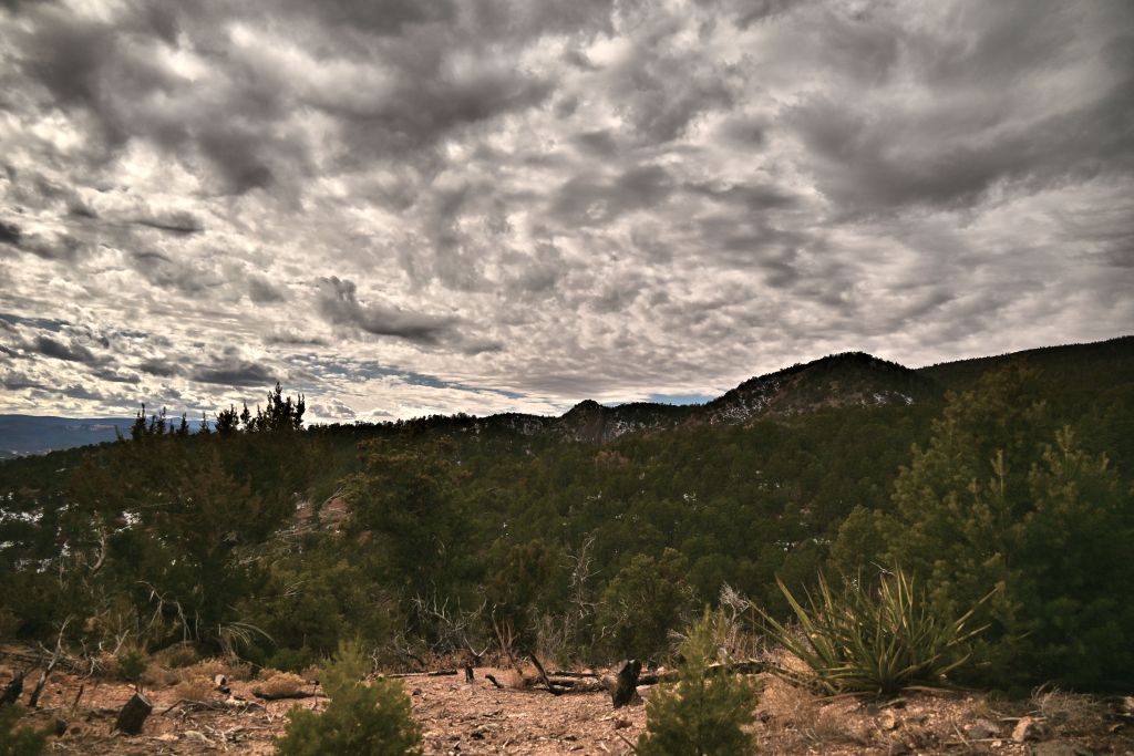
Original RAW
AfterShot
PaintShop
AfterShot versus PaintShop
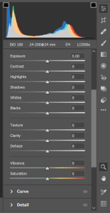
Given these results and questions, I decided it was time to try out other software packages, to see if my RAW troubles were my fault or the Corel software’s fault. I started a free one and downloaded Nikon Capture ND-X, a RAW editor specifically for Nikon cameras. Perhaps I was just getting burned out and wasn’t focused on being systematic at that point, but it was so lackluster that I didn’t even save an image from it. The next obvious one was Adobe, arguably the most well-known photo editing software around. I resisted trying Adobe out for awhile, because I owned the Corel software, and Adobe is a subscription $10/month. I didn’t know if I’d be editing RAW files regularly enough to want to sign up for a subscription, but given my results heretofore, it was certainly worth a gander. Worst case, I thought, I could cancel after a month. The first thing I noticed is that the Adobe’s Camera Raw program had infinitely more adjustment capabilities than Corel’s Raw lab, as shown in the figure below. The two aren’t even on the same playing field. I have no idea how someone could even compare these two RAW file editors, much less say they are on par. I thought for a long time that I was just missing something as a beginner that the rest of the photography world new, but in the end, my experience trying both just simply does not support the use of Corel. If you think Corel is great and I’m just not using it correctly, do send me a message; I’m always happy to learn. But for now, I’ve simply abandoned Corel all together and moved on to paying Adobe $10/month for drastically better software.
Corel Raw Lab
Adobe Camera Raw
Corel’s Camera Raw options versus Adobe’s Raw Lab options
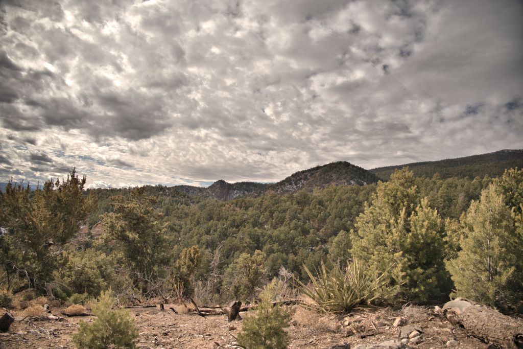
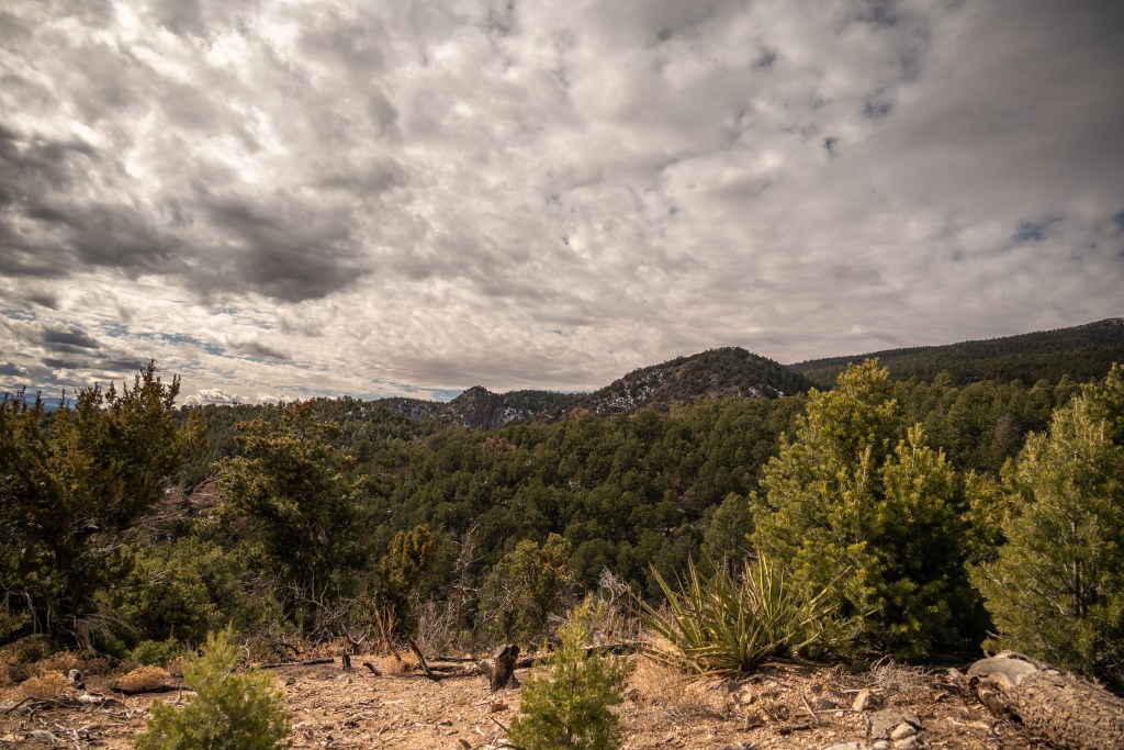
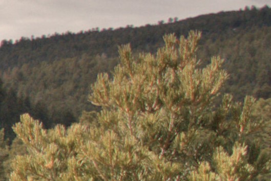
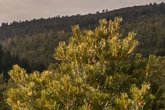
The final piece of evidence that convinced me that RAW files are better than JPEGs, and that moreover Adobe is better than Corel, is the image set below. Ignore for a moment that the overall color is different — this surely can be adjusted with more time. Instead, focus on the close-up views on the bottom. The pine tree in the foreground is so much more vibrant and the tiny trees on the ridge in the background are so much criper when the RAW file is processed in Adobe Camera Raw (right side), compared to RAW file (presumably converted to a JPEG) processed in Corel Raw Lab / PaintShop Pro. While the overview images on the top row both look decent at a glance, I think it’s the details in the magnified views that people are thinking of when they say that a photographer should always work with the RAW files.
Corel Raw Lab + PaintShop
Adobe Camera Raw
Magnified view (Corel)
Magnified view (Adobe)
Close up look at RAW vs JPEG and Adobe vs Corel
In conclusion, I wanted to get into artistic photography for fun; I didn’t want it to be work. I was getting really frustrated with dicking around on the computer with different softwares and different image types, when I just wanted to be out hiking and taking better pictures than my cell phone was producing. I’m glad I persevered, though (with breaks to prevent the frustration level from rising past “throw the camera at the wall”). I’ve gotten over the biggest hump of the learning curve, and believe that moving forward, I should be able to produce some decent images worthy of this website with minimal time at the computer. And of course, the RAW files will be available for further careful editing if I think I’ve got an image that’s worth printing or using for something beyond just sharing on the website. Moving forward, the photos you see will probably be RAW files lightly edited in Adobe’s Camera Raw program.
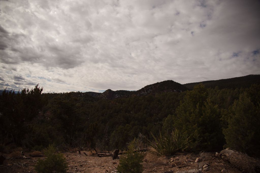
My camera and I are still getting to know each other, and our initial conversations were ad hoc, leading to arbitrary and poorly documented results in the previous posts. Finally, the scientist in me couldn’t help but come out, and I’ve completed a parametric study on shutter time and Picture Control, with some initial analysis on post processing either the RAW or JPEG files. Documented here are my preliminary results, where I am basically using this post as my lab notebook.
First, using an archetype landscape of the Sandias (not shown here), I swept through all 28 Picture Control options, which set clarity, sharpening, contrast, brightness, saturation, hue (coloration), filter effects and toning in the JPEG images processed by the camera. Based on these results, I eliminated several that I didn’t like, and kept 14 for further research. Next, I completed a test matrix of the remaining 14 picture controls and a vector of 9 shutter times (keeping other parameters fixed). Then I explored minimal post-processing of both the RAW files and the JPEGs, to see which file format, picture control, and shutter time led to the best ratio of (nice image) / (effort). One nice example of simple and quick but very powerful post-processing is at this Youtube video.
The first set of images were taken at 0 exposure compensation, meaning at the shutter time the camera determined was appropriate based on the light meter, given my specified aperture and ISO setting. In the original JPEG, the clouds are washed out somewhat and the trees are dark. With minor post-processing in Corel PaintShop Pro 2020, the clouds are given more definition and contrast while the trees are lightened, producing an ok image. The original RAW file (converted to JPEG in PaintShop Pro with no other processing) is worse than the original JPEG, with completely saturated clouds and an even darker tree foreground. After some of my attempts at post-processing, the image remains pretty terrible. Certainly, this result could be due to my ineptitude with post-processing, and a more experienced photographer could recover a nice image from the RAW file. On the other hand, the JPEG required only minor corrections at my skill level to produce a decent image. Point to JPEG.
JPEG, original
RAW, original
JPEG, post-processed
RAW, post-processed
Exposure compensation 0 (shutter 1/1000s, aperture f/4, ISO 100, picture control neutral)
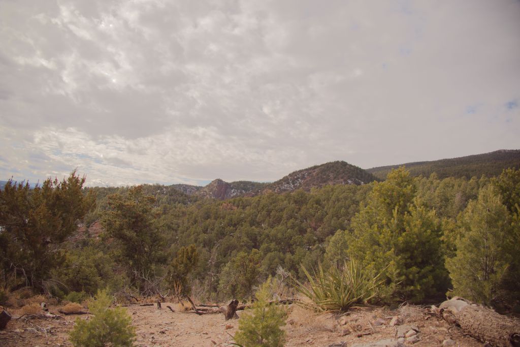
The next set of images were taken at an exposure compensation of ~-1.5, meaning at a faster shutter speed (shorter exposure time), resulting in an overall darker image. This value was selected manually, in order to visually obtain good contrast and brightness of the clouds, at the expense of creating a very dark tree foreground. (In the future, the on-camera histogram would be good to use.)
My first very frustrating observation is that the adjustments in AfterShot Pro and PaintShop Pro behave very differently, even though these two programs are made by the same company, Corel. Adjusting the “fill light” in PaintShop Pro brightens the trees and mountain, while keeping nice contrast in the clouds; in Aftershot Pro, the same “fill light” slider brightens the entire image, completely washing out the clouds. This is a terrible result, which I find very frustrating, since AfterShot Pro is touted on various reviews and forums to be a powerful RAW image processing software. As will all my efforts in this post, perhaps I am simply not using AfterShot Pro correctly; yet, surely I can’t be too far off the mark when the same adjustment in PaintShop Pro has incomparably superior results. Also this blog, though dated, seems to have found the same deficiency with AfterShot Pro. For now, I’ll leave AfterShot and continue all my further edits in PaintShop.
After one adjustment of fill light and clarity, the post-processed JPEG processed in PaintShop Pro 2020 looks quite nice indeed. The RAW image was also transformed into something decent in post-processing, but it took significantly more effort than the JPEG to adjust the color, hue, saturation, vibrancy, etc. Note when a RAW image is opened in PaintShop, the software first opens the RAW lab, which has a couple of possible adjustments. Compared to tutorials that work with RAW files in Adobe’s Camera RAW, the options in Corel’s RAW lab are limited. I believe (though have not been able to confirm) that once you move from the RAW lab to PaintShop, you’re no longer editing the RAW file anymore. Therefore, at this point, the edits I do in PaintShop to the RAW file and the JPEG are similar, I believe, just with a different initial starting point. Therefore, I do not believe I am exercising the power of RAW files when I’m working with them in PaintShop.
Finally, we must consider lens distortions. The lens I am using (Nikon Nikkor Z 24-200mm f/4-6.3) has significant distortions, which are corrected by the camera when it processes JPEGs, but which must be corrected manually when working with the RAW files. A recent update in AfterShot now has the lens corrections for this lens; however, the RAW lab in PaintShop does not. I can open a RAW image in AfterShot, apply the lens correction, then get the parameter values and manually type them into PaintShop. Possible, but certainly a painful workflow.
Given how nice the post-processed JPEG turned out, with much less effort, with lens distortions already corrected, point again to JPEG.
JPEG, original
RAW, original
JPEG, post-processed in PaintShop Pro 2020
RAW, post-processed in PaintShop Pro 2020
JPEG, post-processed in AfterShot Pro 3
RAW, post-processed in AfterShot Pro 3
Exposure compensation ~-1.5 (shutter 1/4000s, aperture f/4, ISO 100, picture control neutral)
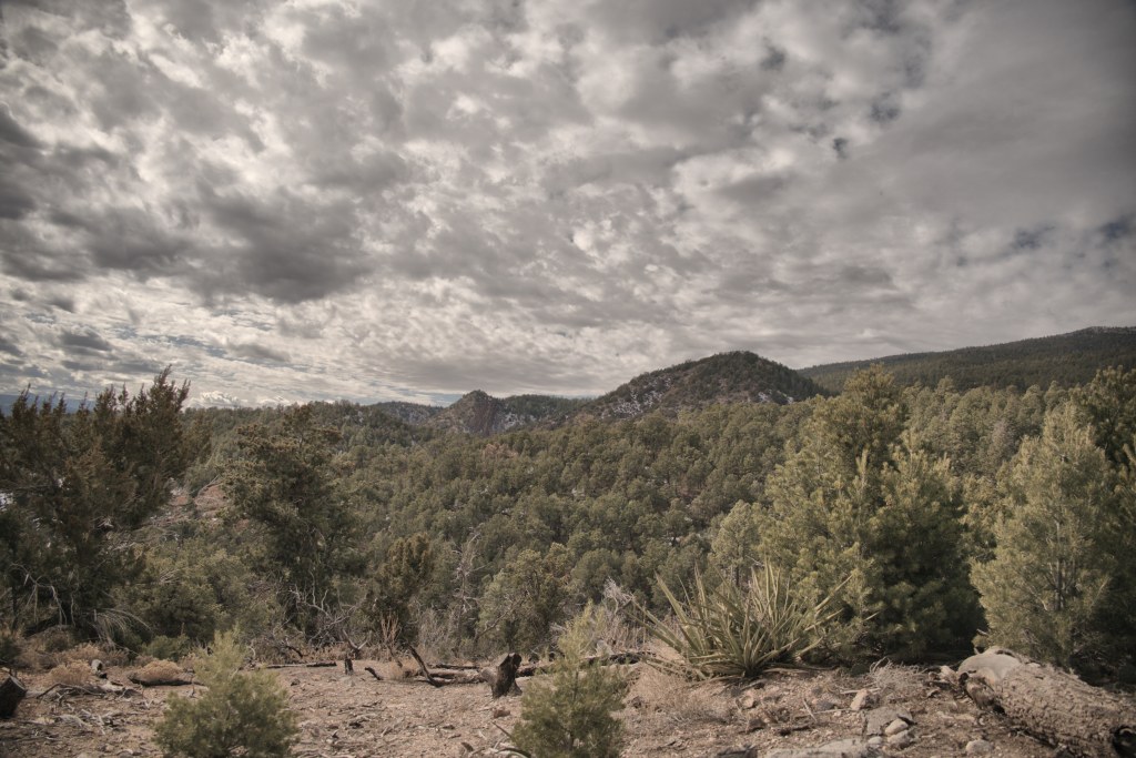
Two post-processed JPEGs from above are set side-by-side to compare exposure compensations of 0 (lighter) or -1.5 (darker) for the exemplar scene. Clearly, starting with the darker image leads to a superior post-processed image with better contrast and dynamic range. Again, these results may differ with an experienced photographer spending more time in post-processing, but for minimal effort, an inexperienced person can take an underexposed JPEG and end up with a decent image. Lesson learned: for scenes with a bright sky and darker land, I’ll aim to underexpose slightly.
Exposure compensation 0
Exposure compensation ~-1.5
Comparison of two different exposure compensations, with JPEGs (neutral picture control) after minimal post-processing
Given the conclusions drawn so far (work with JPEGs, under expose the image), I explored the picture controls in more detail, to see which was most pleasing for our exemplar backyard mountain scene. All images were lightly processed in PaintShop Pro, with a quick adjustment of fill light and clarity to lighten the mountains while keeping the contrast in the clouds. More adjustments could always be made, but the idea here is to let the camera do the work so I don’t have to. If I can get a better feel for effects of all the picture controls using this systematic study, then I can select an appropriate one more quickly and confidently out in the field.
The first set of images shows the 8 picture controls that are polychromatic. For this scene, I liked Portrait and Pop the best, with Neutral and Standard being ok. Flat, Landscape, Vivid and Sunday weren’t my favorites. Based on this data, I’d chose Portrait as my default setting for this type of landscape scene.
Portrait
Pop
Neutral
Standard
Flat
Landscape
Vivid
Sunday
Polychromatic the picture controls
In the next set of images, I show the monochromatic or quasi monochromatic picture controls. Dream, Toy and Silence are pretty heavy filters that I wouldn’t want to use as a general default, but could be fun in certain circumstances. (Toy specifically I don’t particularly care for for landscape scenes, though anecdotally, it can be fun for Hercules.) Monochrome, Charcoal, and Sepia can all be nice schemes if you’re in the mood for it. But these images did make me wonder — can I select a default polychromatic picture control, and recover the monochromatic versions later in post-processing, and thus get the best of both worlds?
Dream
Monochrome
Charcoal
Toy
Silence
Sepia
Monochromatic or quasi-monochromatic picture controls
Thus we are brought to my final investigation with our archetype Sandia landscape. At this point in the day, I was becoming weary of working at the computer (as perhaps you are weary of reading this post), so this last analysis was brief. I started with the Portrait polychromatic image, and adjusted either the vibrancy or saturation to generate two different gray-scale images. I also created a sepia effect using either the built-in sepia photo effect in PaintShop Pro, or by manually adjusting the vibrancy and the green and blue curves. For the gray-scale images, I slightly prefer reducing the vibrancy over reducing the saturation, though both produce images that are comparable to the Monochrome or Charcoal picture controls processed on-camera. For the sepia effect, the photo effect in PaintShop Pro severely reduces contrast and degrades the image, in my opinion. There is only one effect adjustment “amount to age”, which I found insufficient to produce a nice sepia image. Manually adjusting the vibrancy and curves proved more promising, and this image could probably be improved with more tinkering. I still prefer the Sepia picture control on-camera, but it’s good to know that if I don’t commit to applying that picture control in the field, there’s likely a way to obtain a similar effect in post-processing.
Saturation -100
Vibrancy -100
PaintShop Pro sepia photo effect
Manual adjustment of vibrancy and curves
Polychromatic “Portrait” image transformed to monochromatic or sepia in post-processing.
That concludes this episode of rigorous investigation of file format, picture controls, and basic post-processing. Based on these results, I will be working predominately with slightly underexposed (at least in cases with a bright sky and dark land) JPEGs processed on-camera with Portrait picture control. Based on sage advice, I’ll go ahead and save the RAW files (as long as frame rate and storage space aren’t concerns) so that future-me, who is perhaps more discerning and simultaneously better at post-processing, can go back and really tinker. Current-me, though, is happy to let the camera do most of the work.
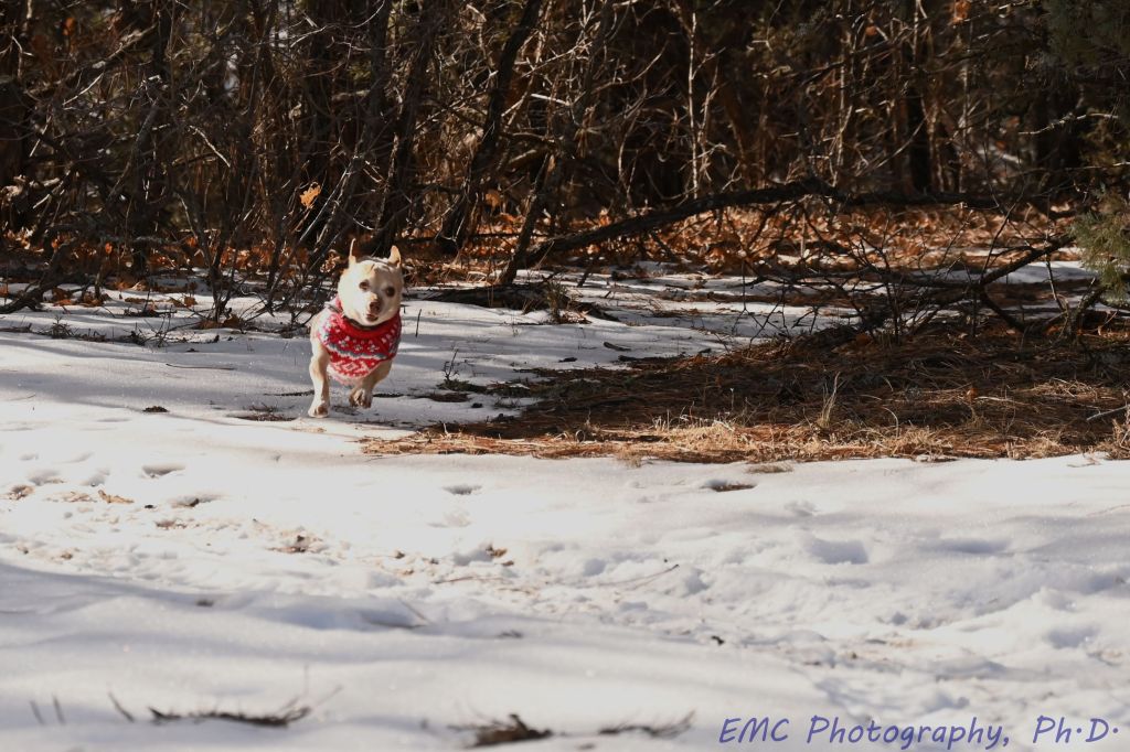
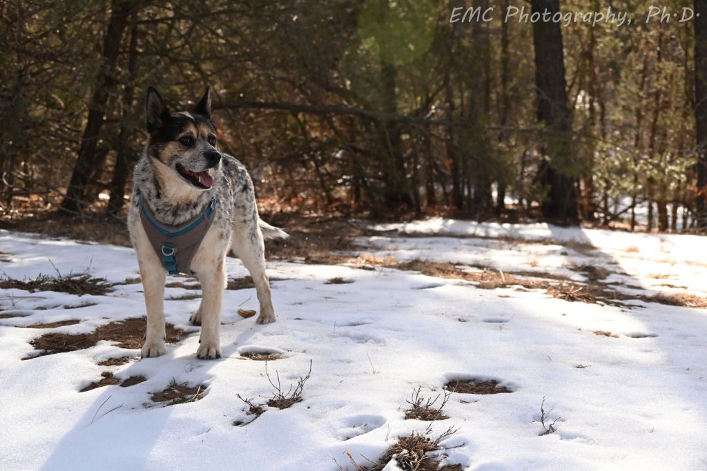
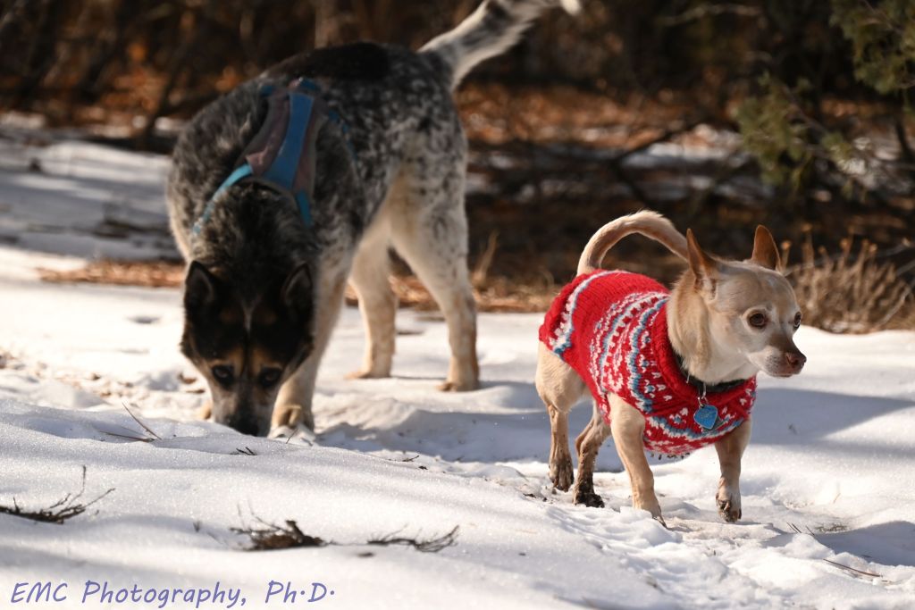
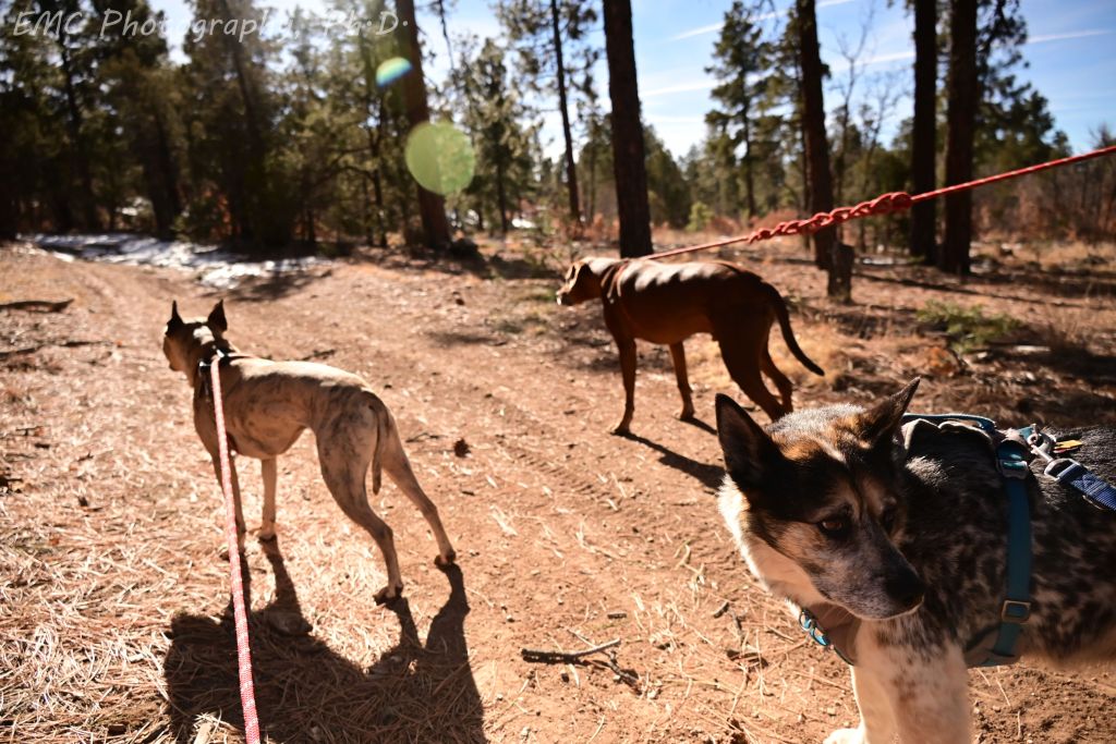
We took a walk in the Pine Flats area with friends Flint and Arthur and their Ginger.
Flint and Arthur: Taking his support-dog role seriously, the chihuahua-corgi mix (little but fierce) bravely leads his raccoon-healer brother down the trail, transforming the “too broke” dog to the happiest pup around (especially when there’s snow crack to be had)
Flint wins snaggle-tooth-shake
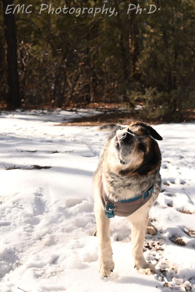
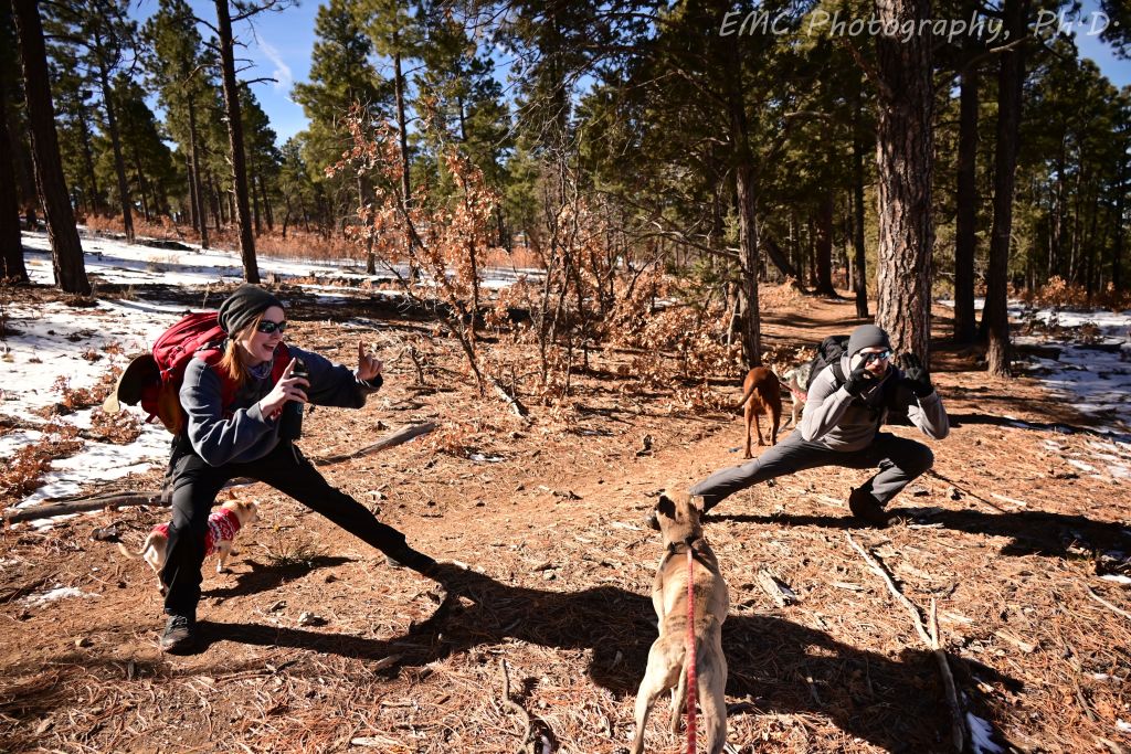
Fitz continues to own dignified-old-dog-in-black-and-white; Three big pups ready to go down Mahogany; Our ginger and the hubby demonstrating the “action pose” that I need to practice; Tired dogs settling down in the van for the ride back home
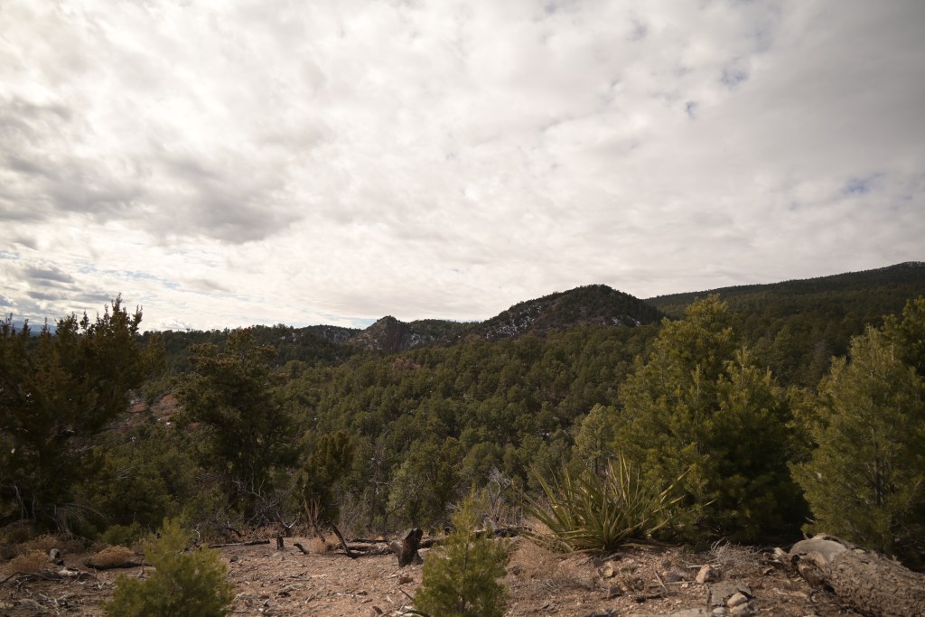
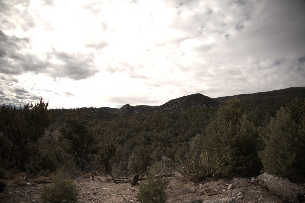
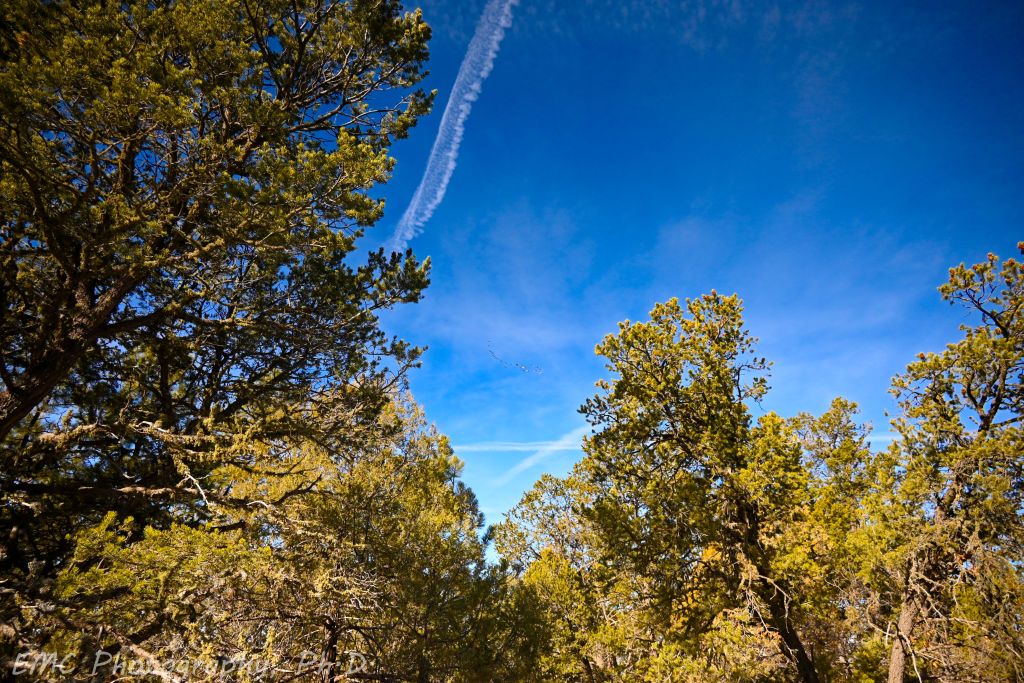
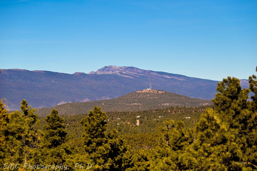
We took the pups on a walk at Pine Flats, so of course, I brought my camera. In one of the shots below, I was trying to capture the flock of birds, but in the end, I mostly just liked the composition of the trees against the blue sky. There are also some lovely views of the Sandias from Gamble Oak and Easy Pickins, viewing them from across the trees of the Manzanitas. I also played around with some post-processing for funsies. There are so many sliders in the software (saturation, vibrance, blacks, contrast, to name the ones I liked best), and they’re all frictionless, I was worried I was going to over do it. Mark, without seeing anything, said maybe I wasn’t going far enough and told me to be bold. So here ya go.
Flock of birds; Views of the Sandias from across the trees of the Manzanitas
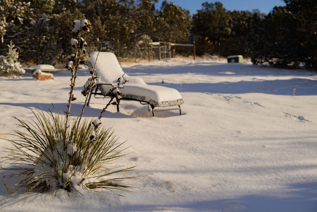
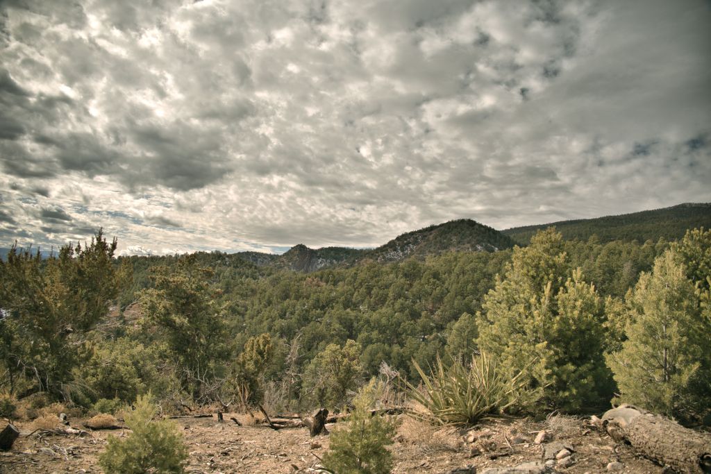
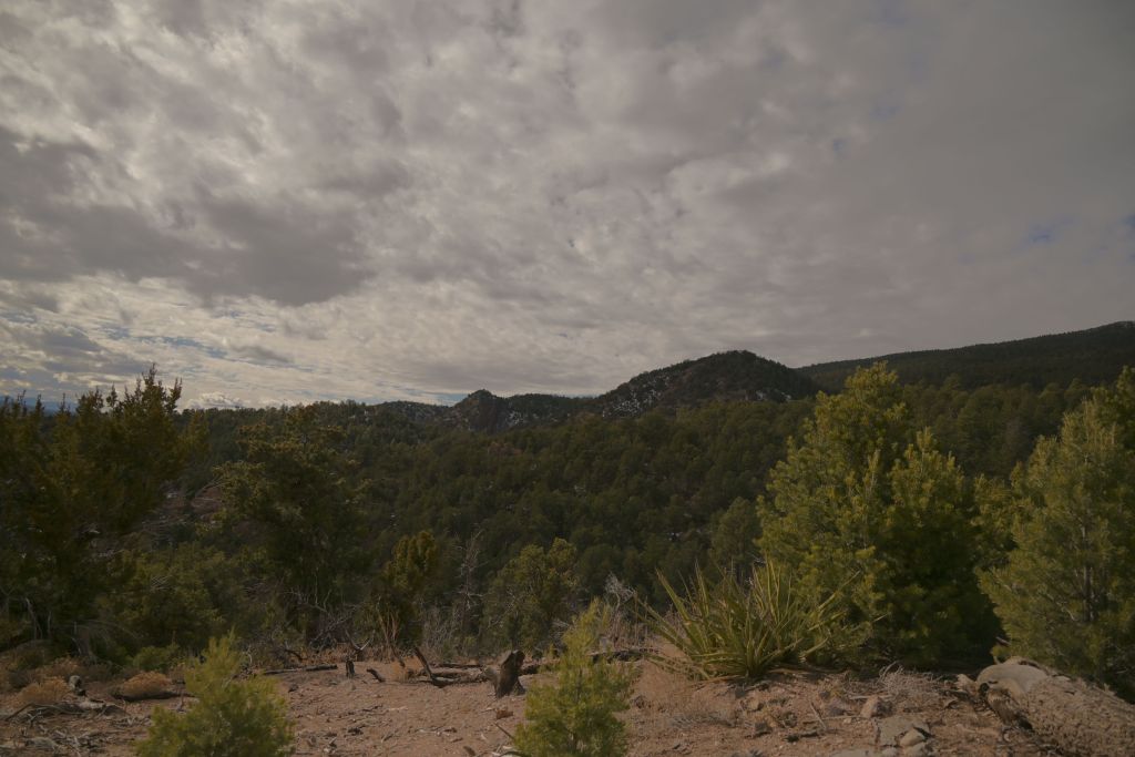
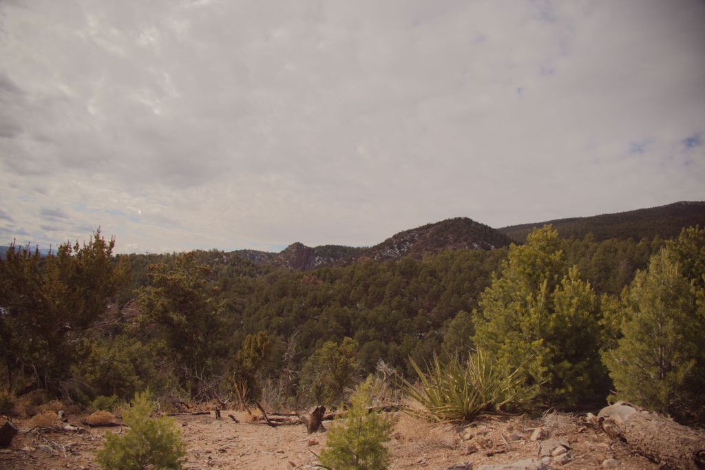
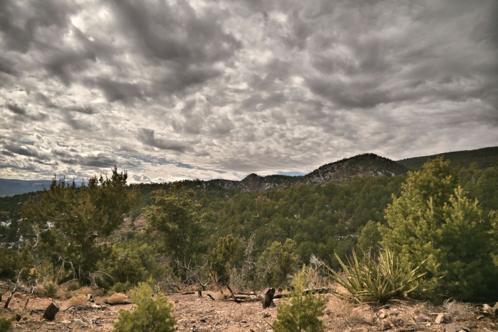
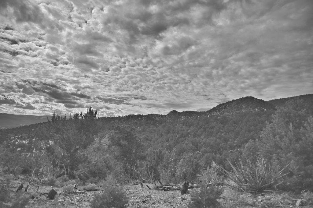
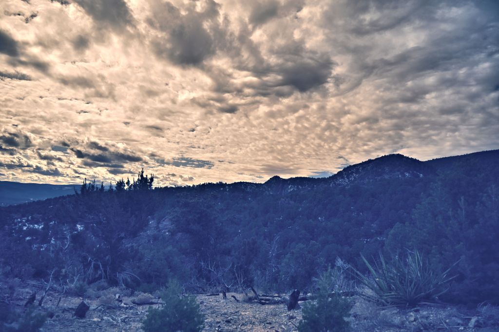
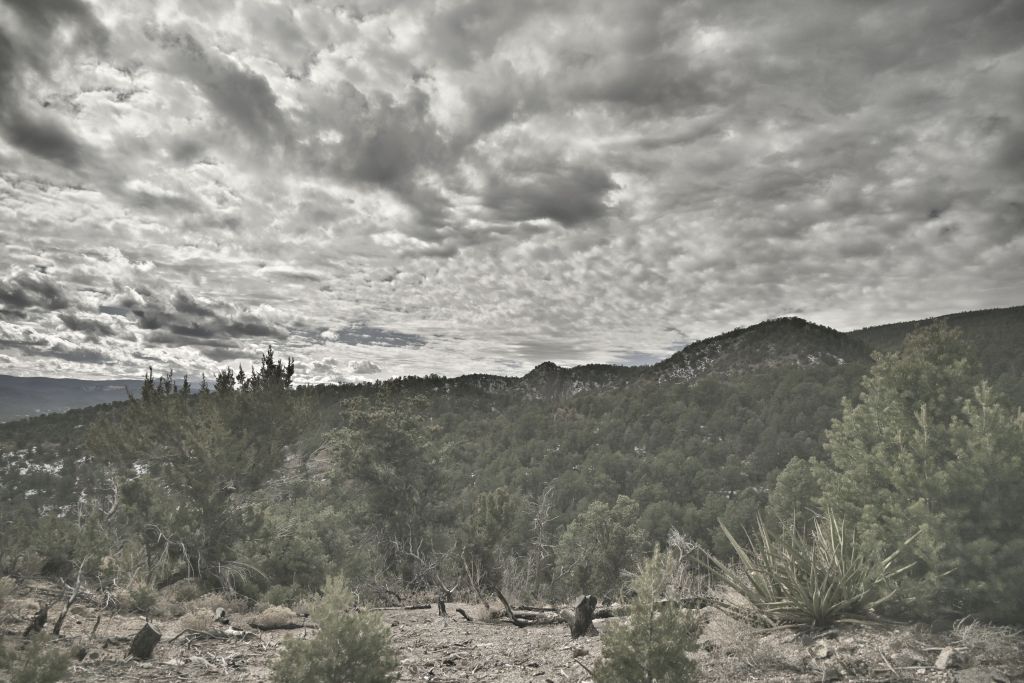
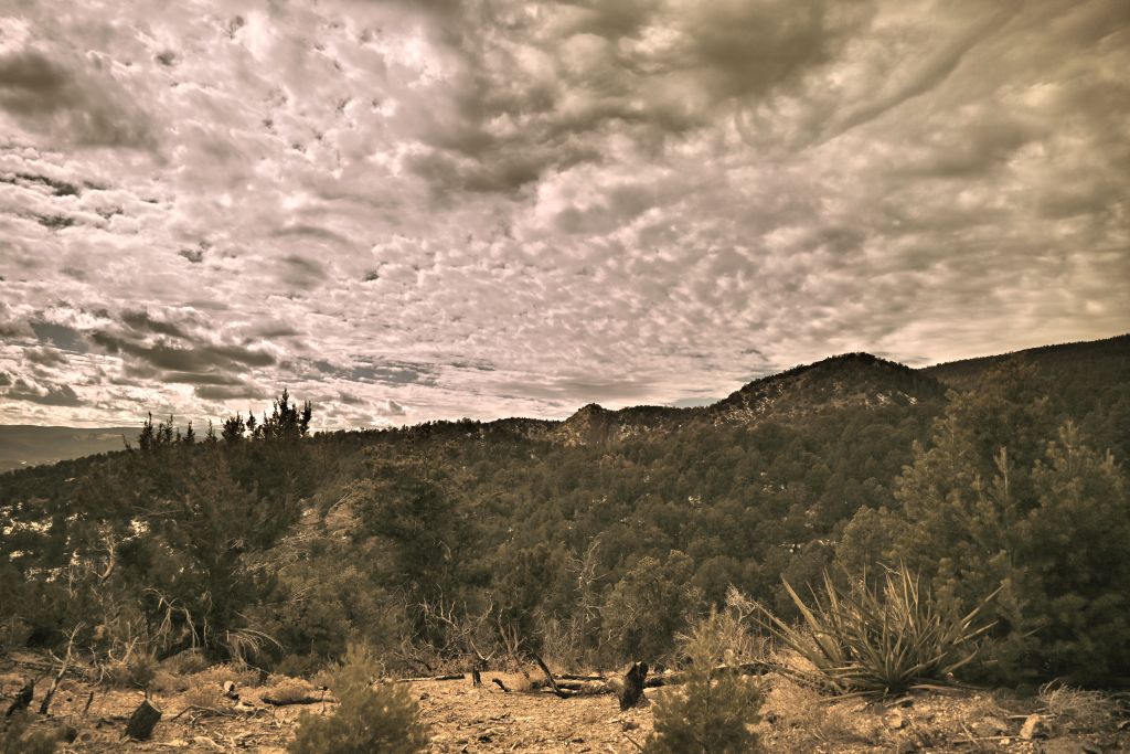
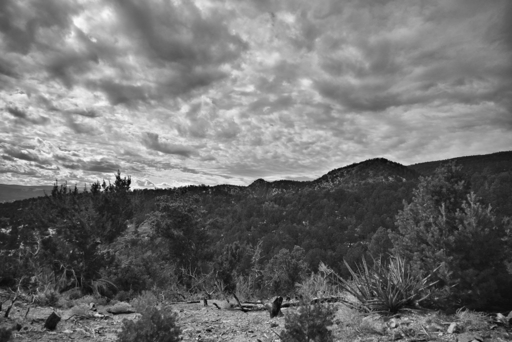
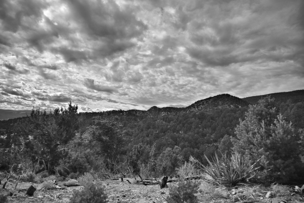
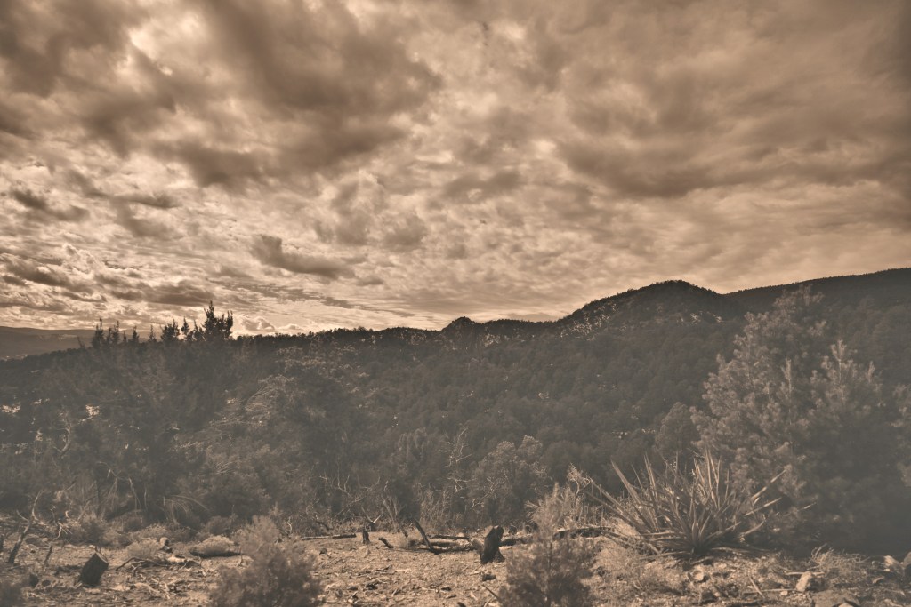
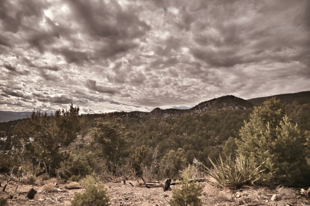
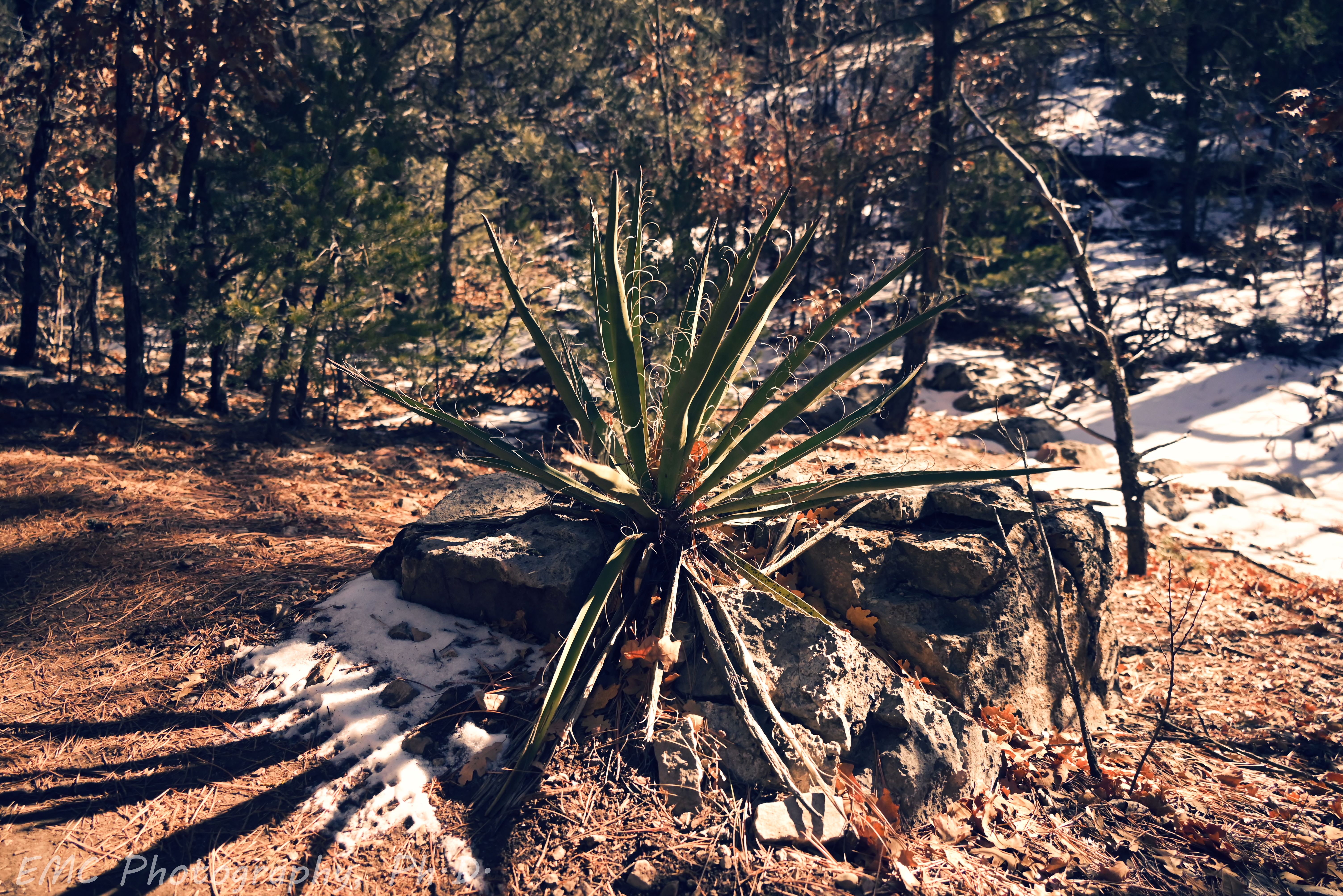
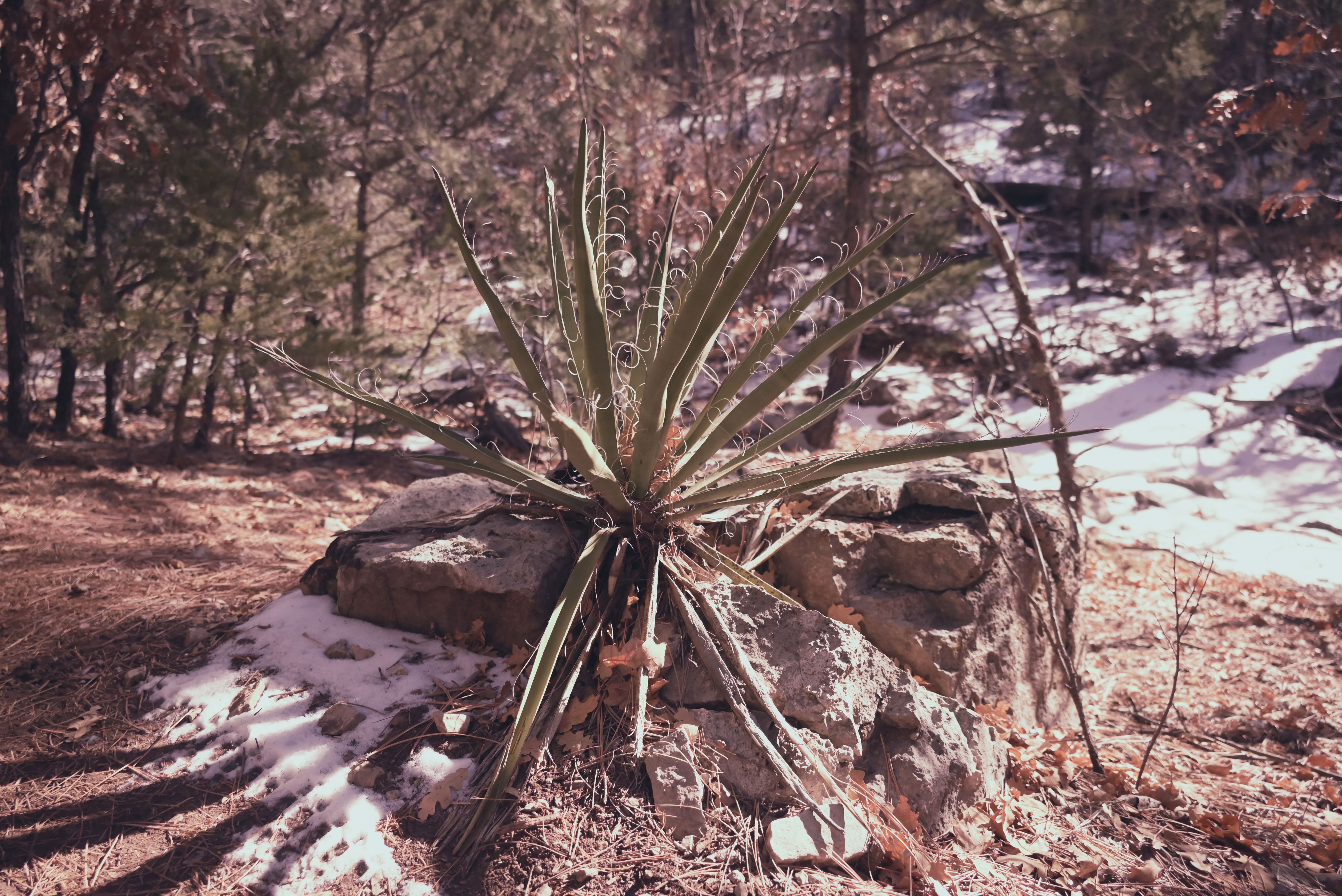
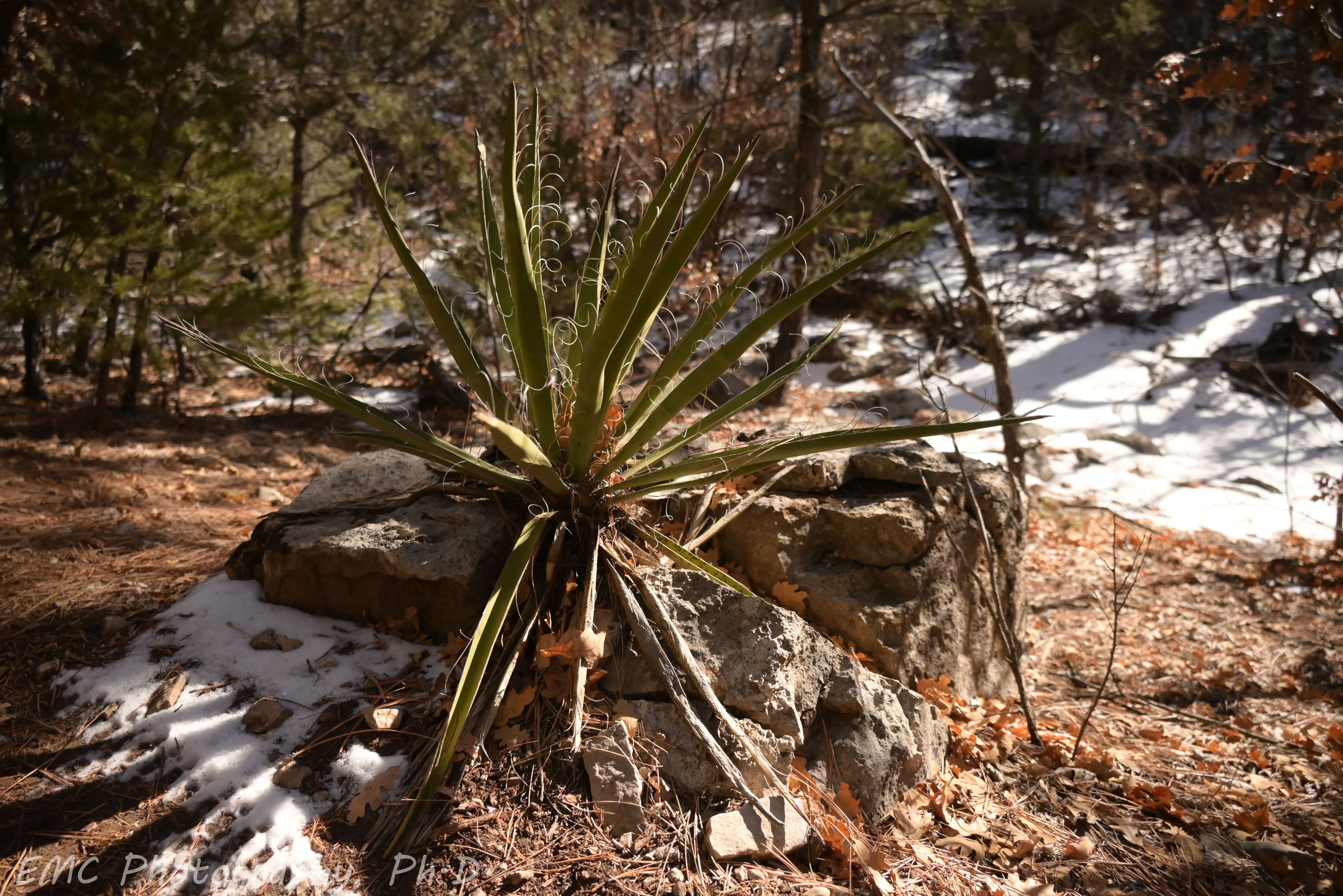
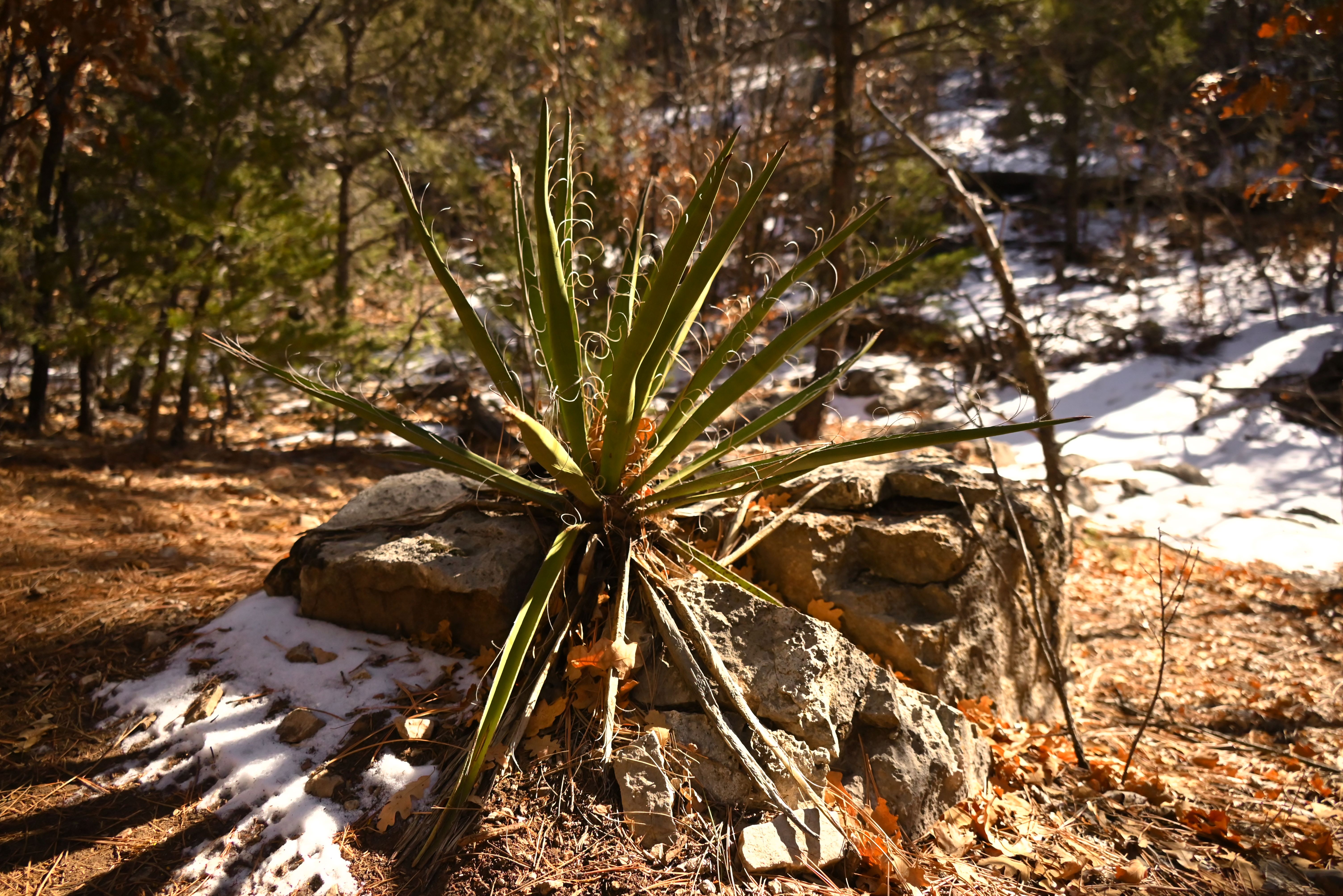
My current bane is deciding which “Picture Control” to use on the camera. These are pre-defined filters (for lack of a better term in my limited photography vocabulary) that Nikon has programmed. It seems from some very cursory reading of internet forums that photographers can be split into two categories: those who want post-worthy pictures straight off the camera, and those that expect to devote some care in post-processing. The first group applies filters in-camera while composing a shot and saves JPEGs with the color scheme largely baked in; the second group captures RAW images and spends hours at the computer afterwards. I spend enough time at the computer for work, so I’m in the first group. However, I have yet to fully appreciate the different filters and their effects of the images, so I am still repeating shots as I scroll through the options. The problem is that when I get home, I forget which filter was used in which image, and sadly that information isn’t saved in the meta-data, so learning is slow right now. At some point, I’ll camp out in the yard with my lab notebook and record detailed annotations about filters, but in the meantime, which yucca do you like best?
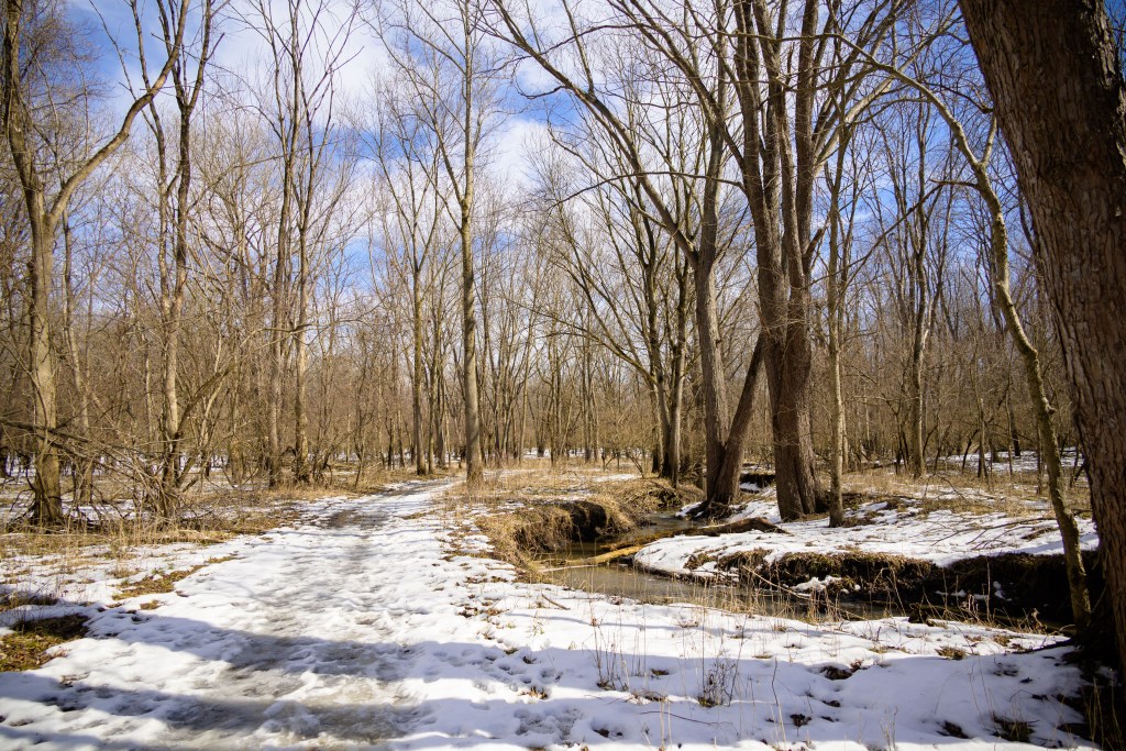
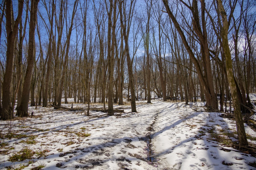
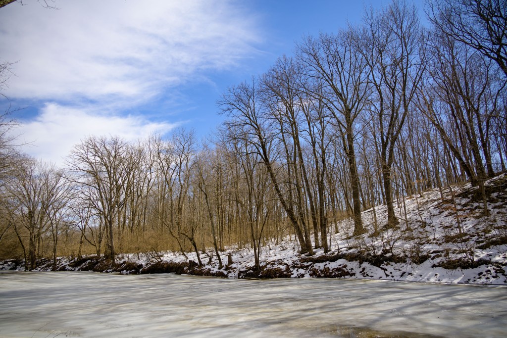
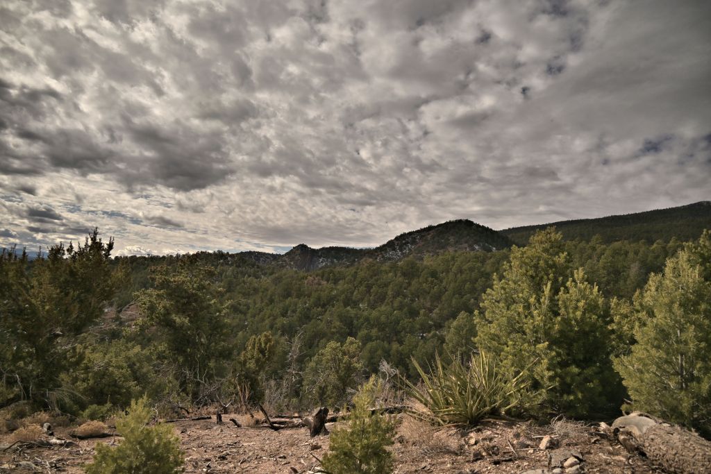
My motivation for trying my hand at photography were the amazing vistas I’ve seen while hiking on skyline trails above the tree line. I was fed up with my cell phone not capturing the sentiment I felt looking out over the expansive landscape. But I bought my new camera in January, which is not a particularly amenable time to hike at 12k feet, especially if you prefer frequent warm-ups during snow play. So I’m starting out more local with some photos of my “extended back yard”, and I’m pleased to find scenes that I’ve walked past innumerable times that are worth photographing.
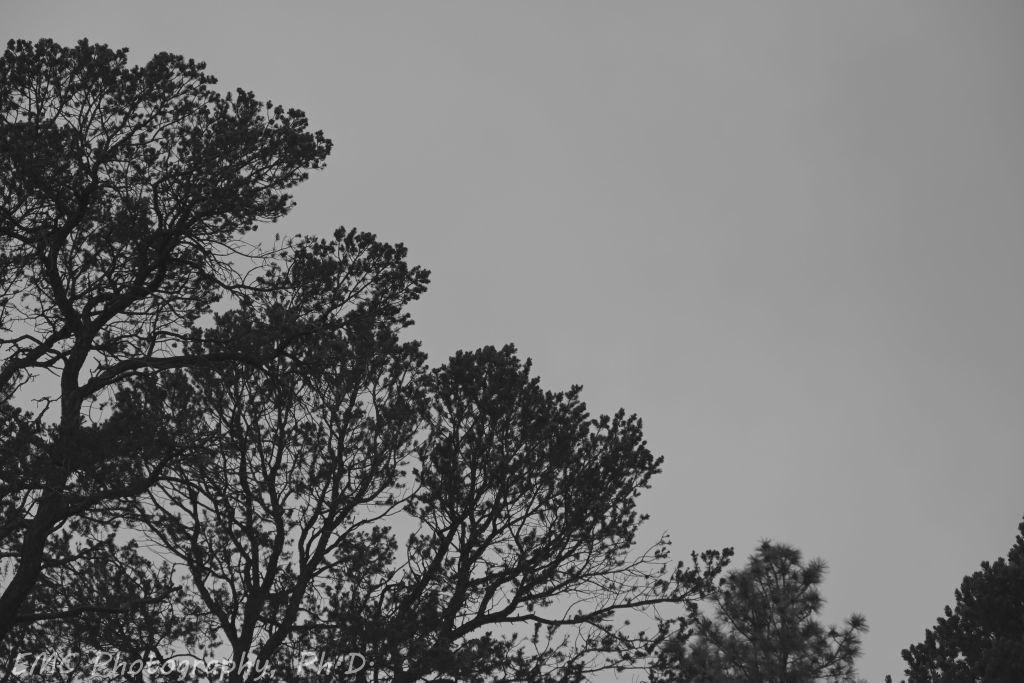
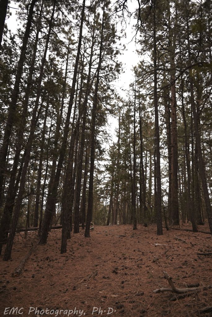
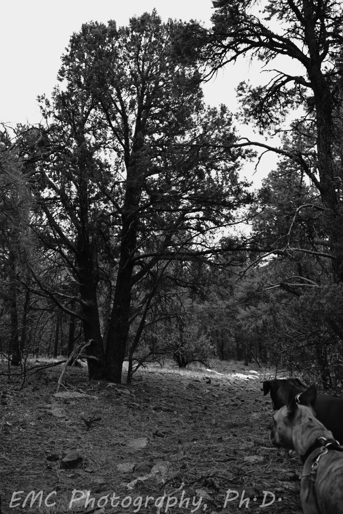
Ponderosa pines are without a doubt my favorite New Mexican tree. They are tall and majestic with their long needles, which make a soothing sound in the wind like no other, and the “inside-out” look to the bark is fascinating. But I think the real reason I love them is because the best running trails are ubiquitously through the ponderosas. It’s a chicken-and-the-egg question: Do ponderosas only grow where the ground is good soft dirt, or have ponderosas in ages past transformed the rocks into a smooth path? Either way, running through them centers my chi.
Pinion tree and Ponderosas on Faulty trail
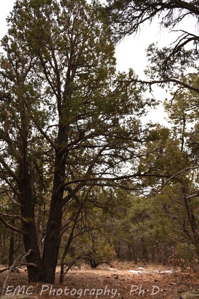
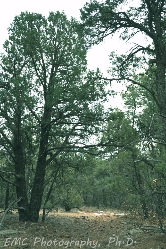
Alligator cedars are another unique tree and a rare gem in the Sandias. Zoom in close and look at the bark — it’s textured like an alligator! Overall, they are relatively rare, except in a couple of places I’ve found where they’re almost dense enough to constitute a grove. For these images, I took a little time to play with some different filters. In the last one, the pups were asking pretty hard to keep walking down the trail.